
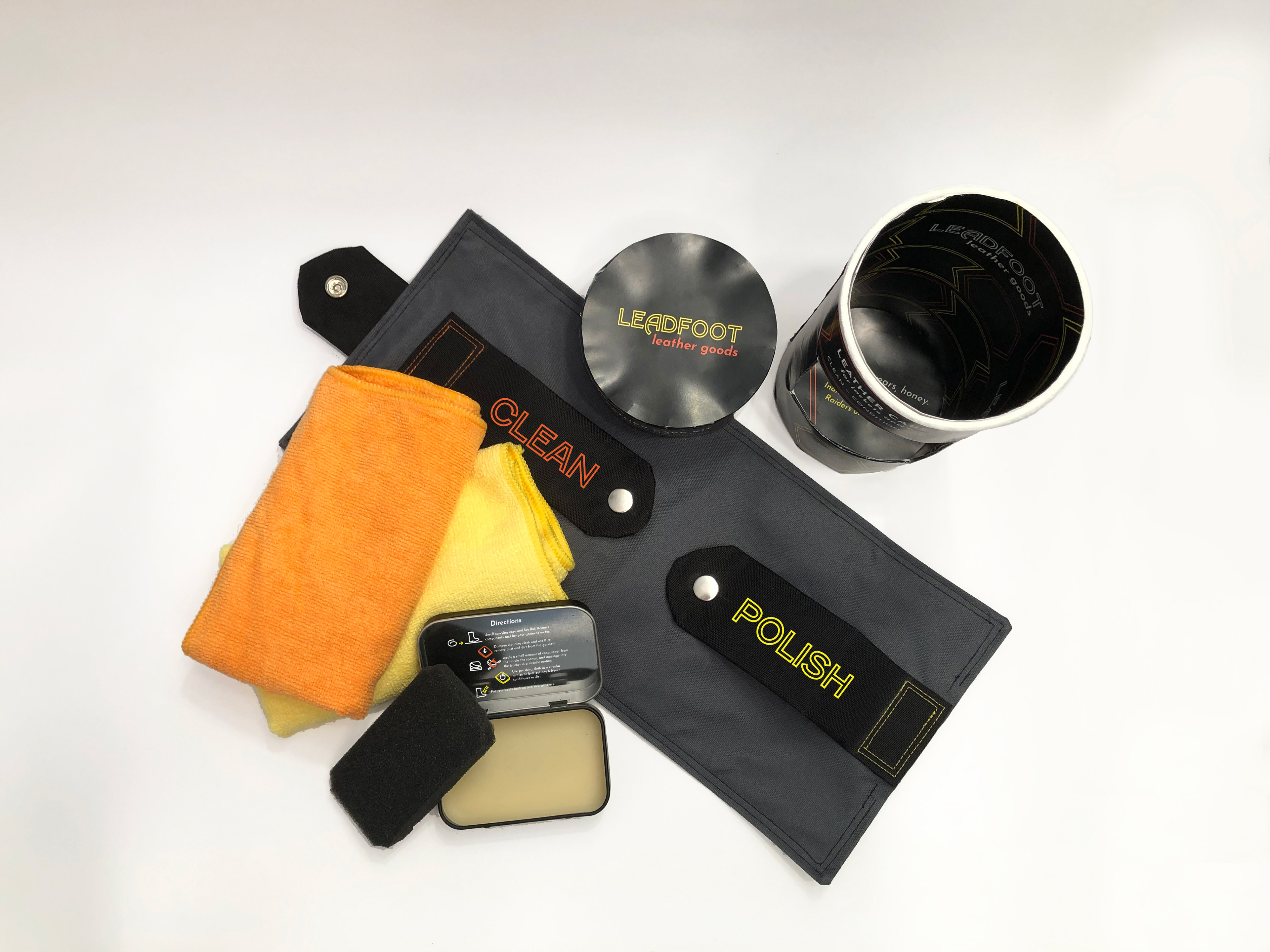
Final mockup of the packaging with the telescopic lid removed and custom fabric roll-up case set to the side.
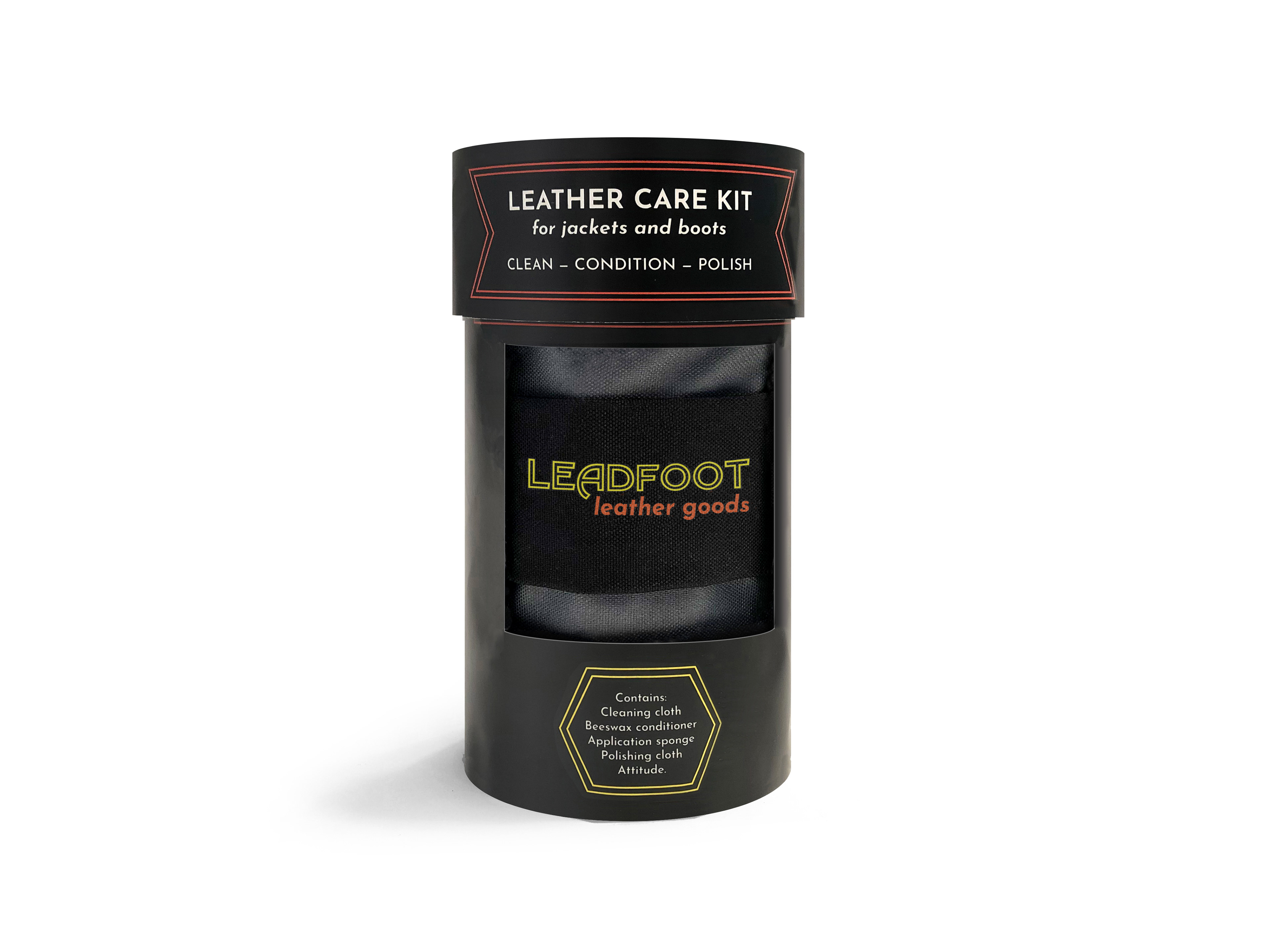
Front view of the packaging as it would appear on the shelf; the reveal in the front of the tube showcases the logo on the canvas case.
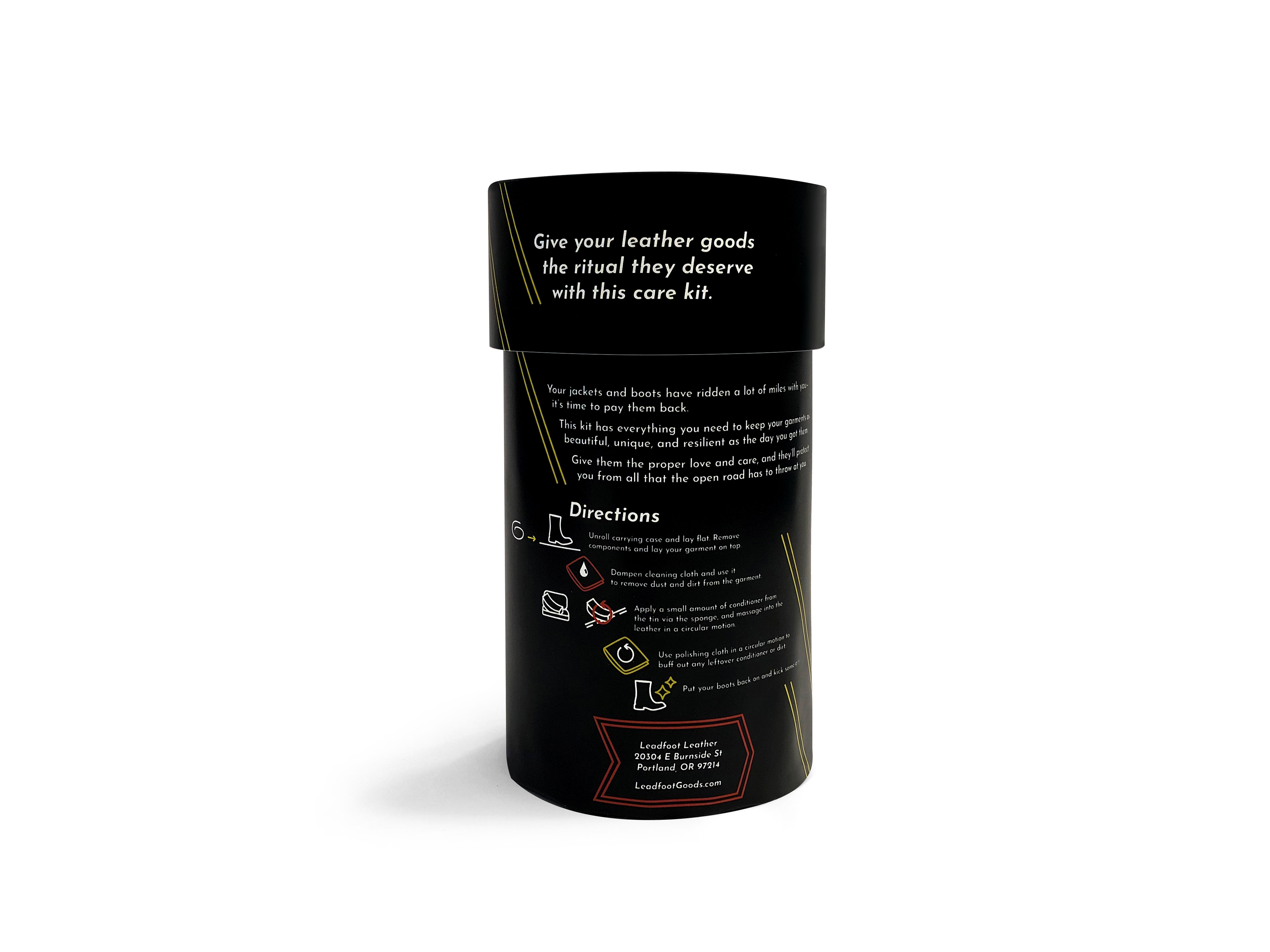
Back view of the packaging with sell copy, directions for use, and manufacturer information.

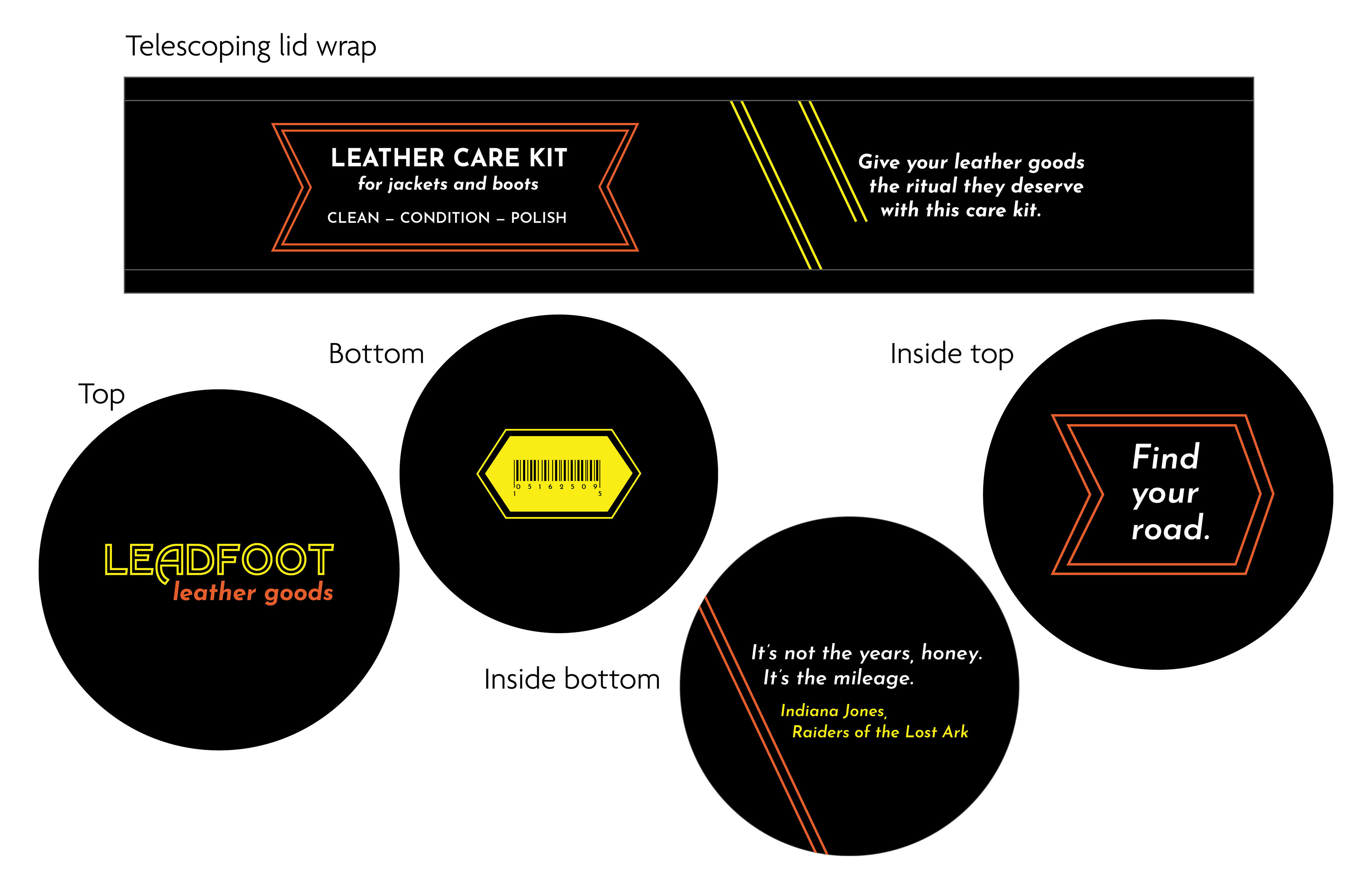
3/4 view of the back of the packaging. Diagonal yellow lines on the lid match up with those on the main tube, and orange, white, and yellow illustrations help explain the directions.
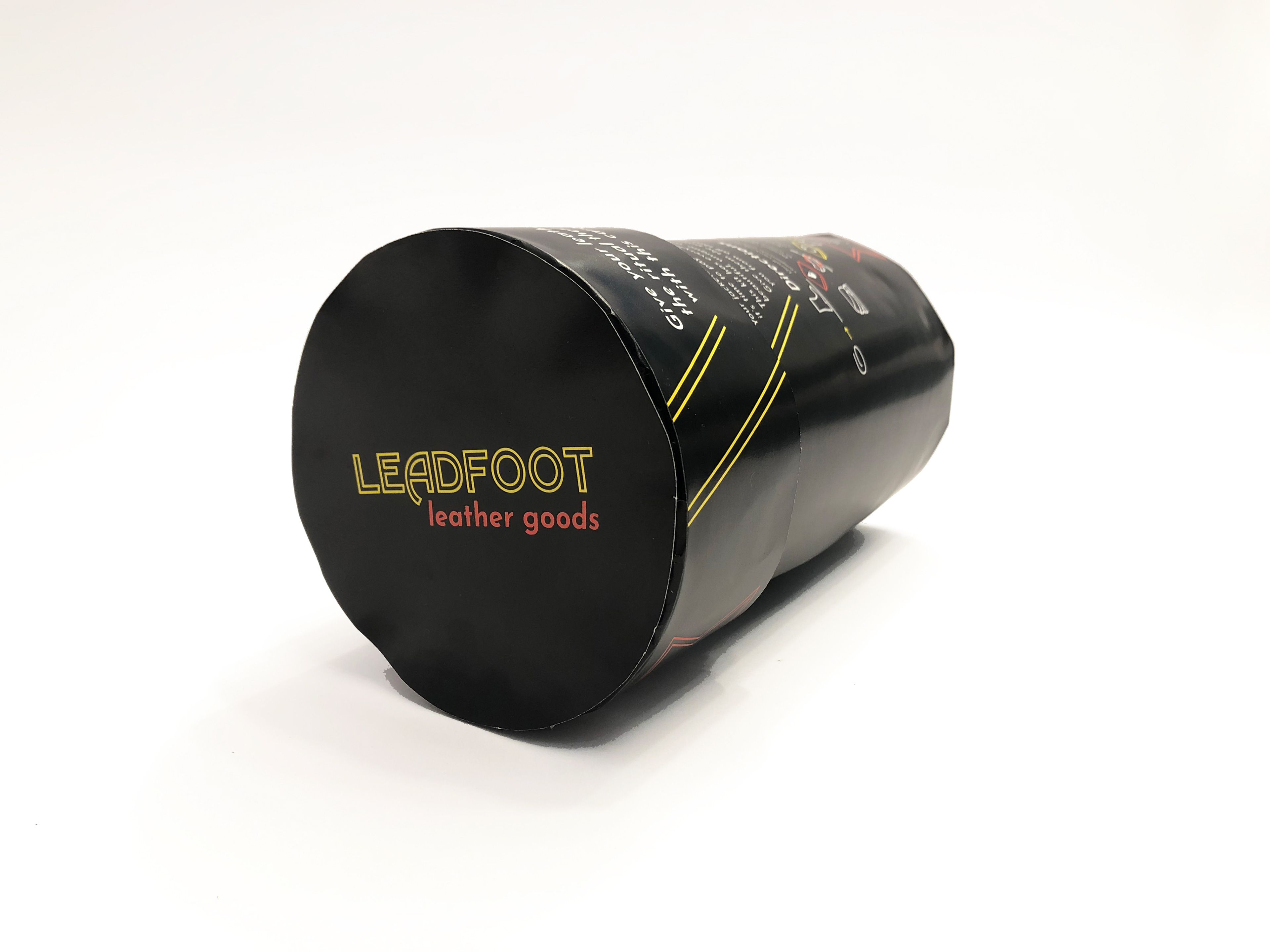
Top of the packaging, with company logo.
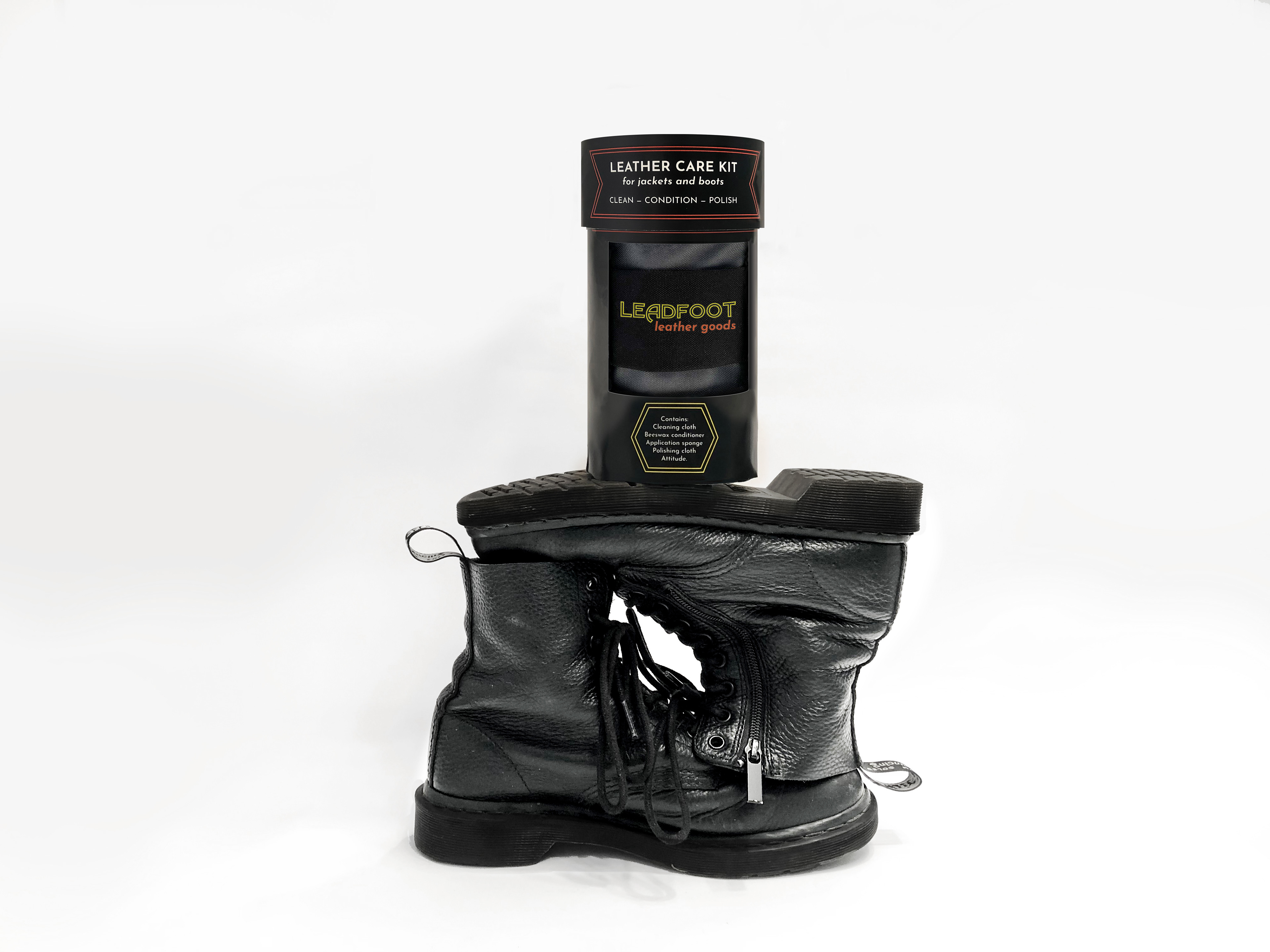
Packaging staged with boots
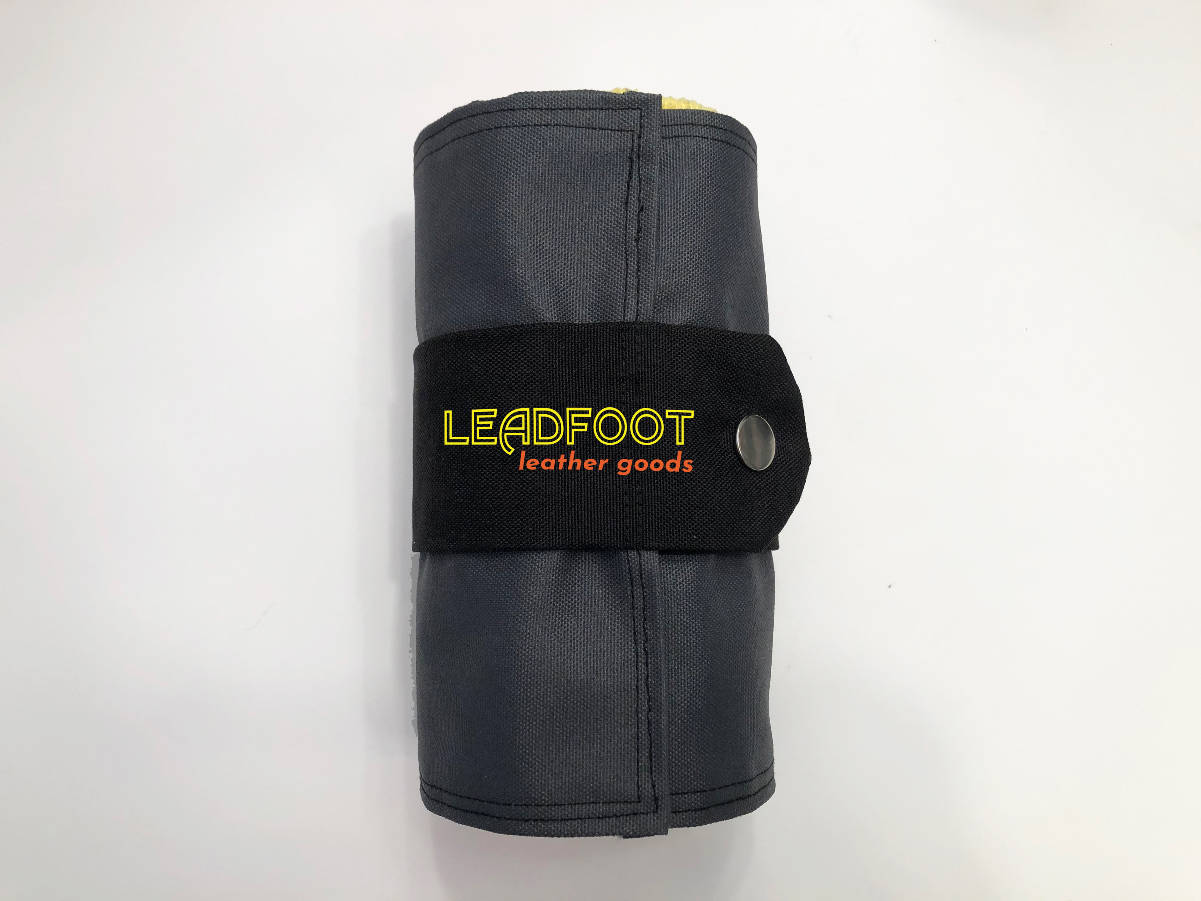
Canvas roll-up case removed from packaging.
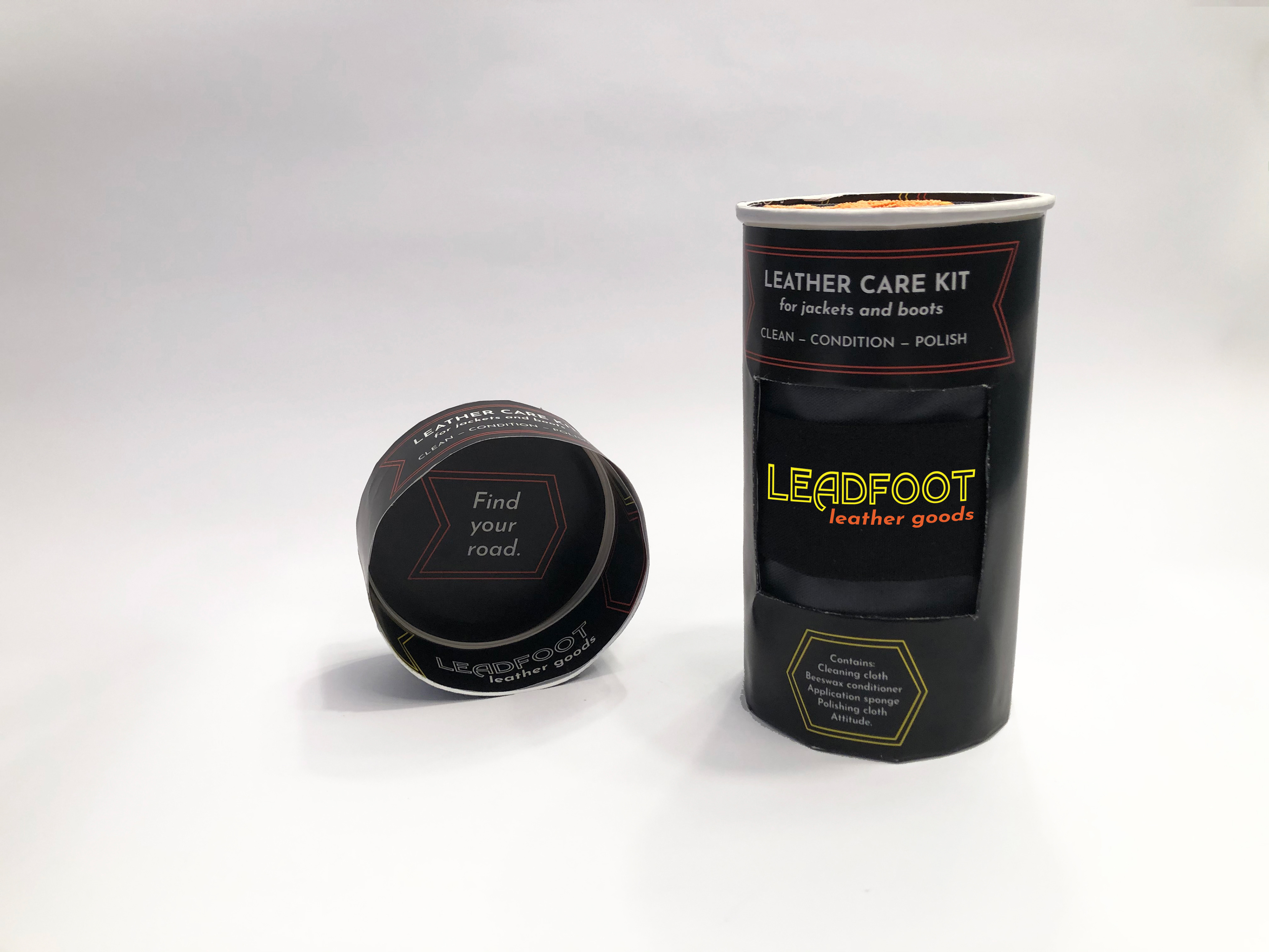
The style of the outside of the packaging continues onto the inside, with "find your road" on the inside of the lid.
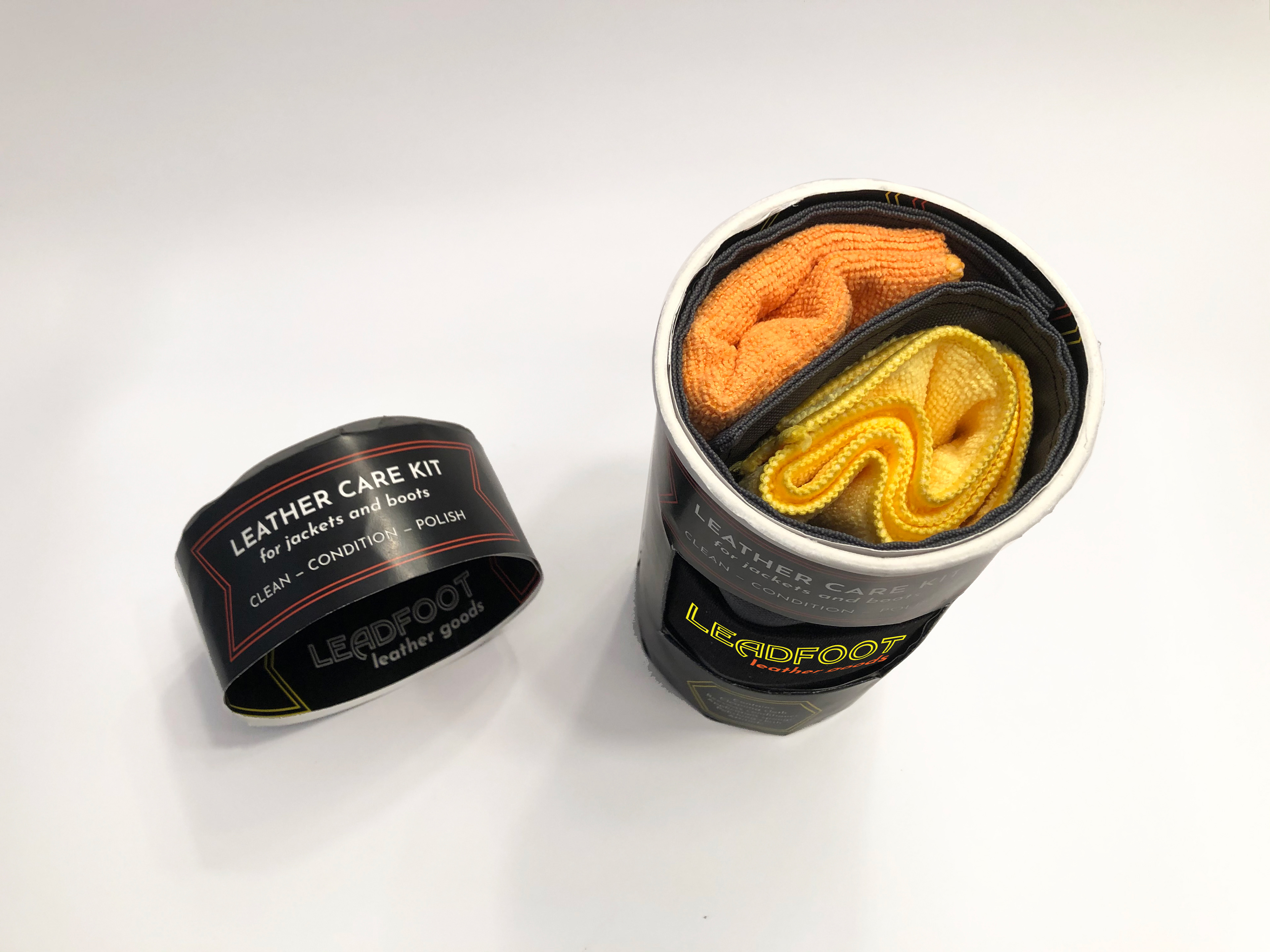
Top view when lid is removed. Canvas case fits snugly inside the tube, and the orange and yellow cloths coordinate with the orange and yellow on the outside of the packaging.
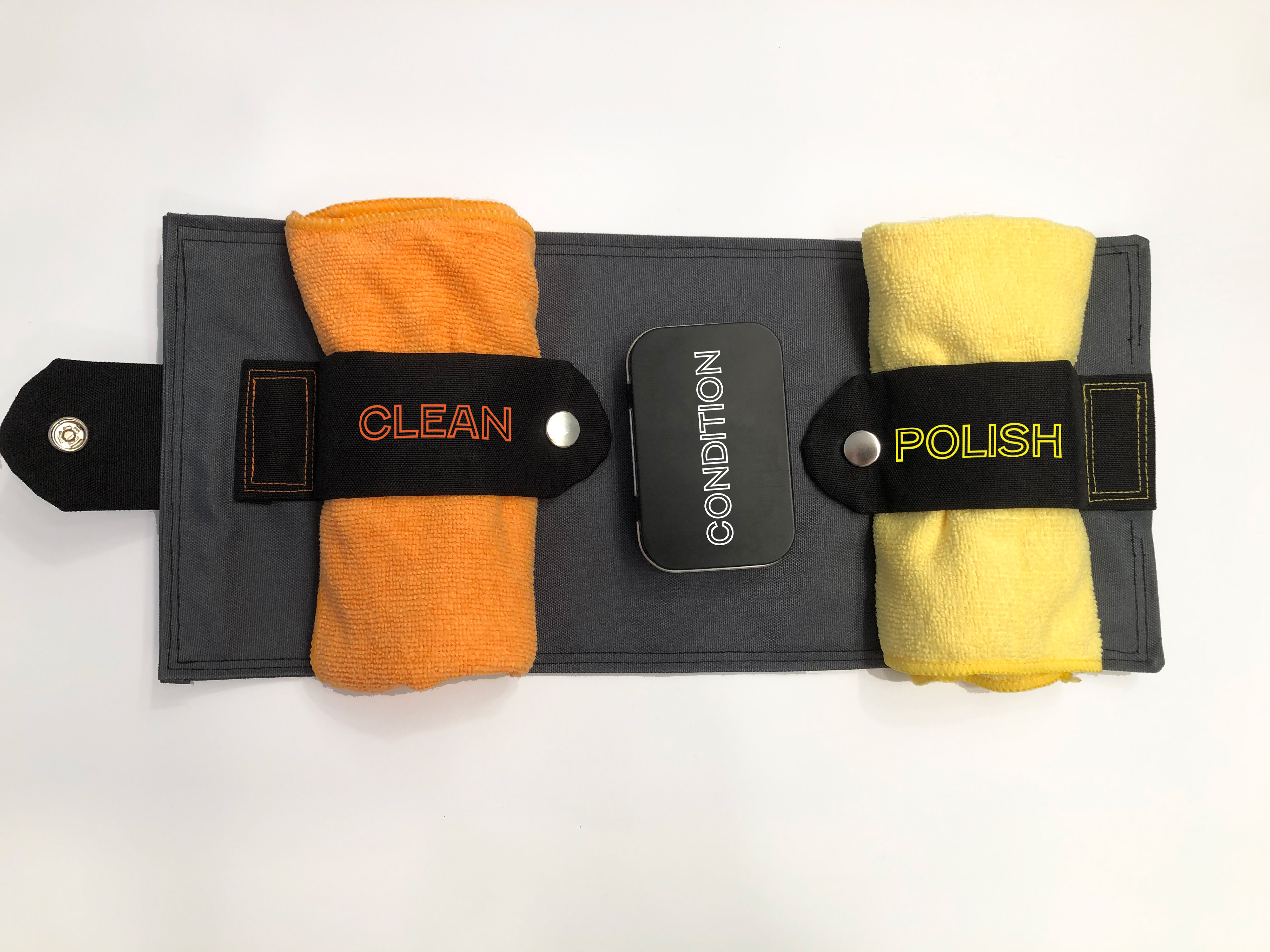
Top view when the roll-up case is open. The cloths are easily held in place with snaps; the color of the "clean" and "polish" text, as well as the stitching, matches the cloths themselves. The tin of conditioner snaps into the case via a magnet.
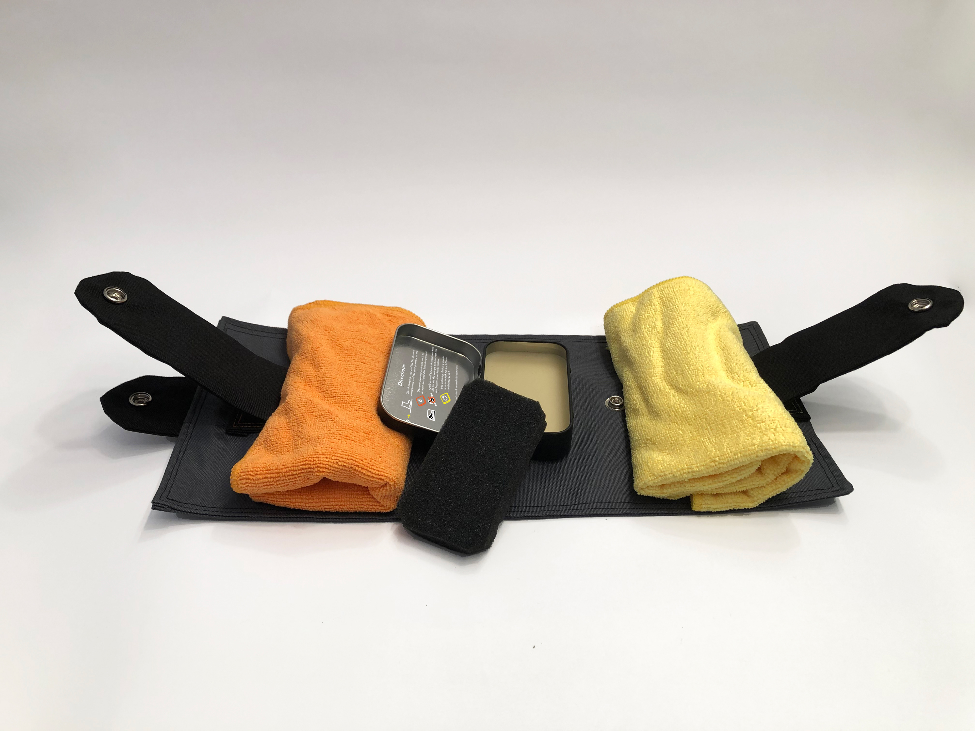
Without having to consult the packaging, the user can follow the steps of leather care from left to right. The directions are also printed on the inside of the tin of conditioner, which houses both the conditioner and the sponge applicator.
Top view of the primary and secondary packaging, with objects removed.

If necessary, the user can place their leather goods on the canvas roll itself, to protect their work surface.
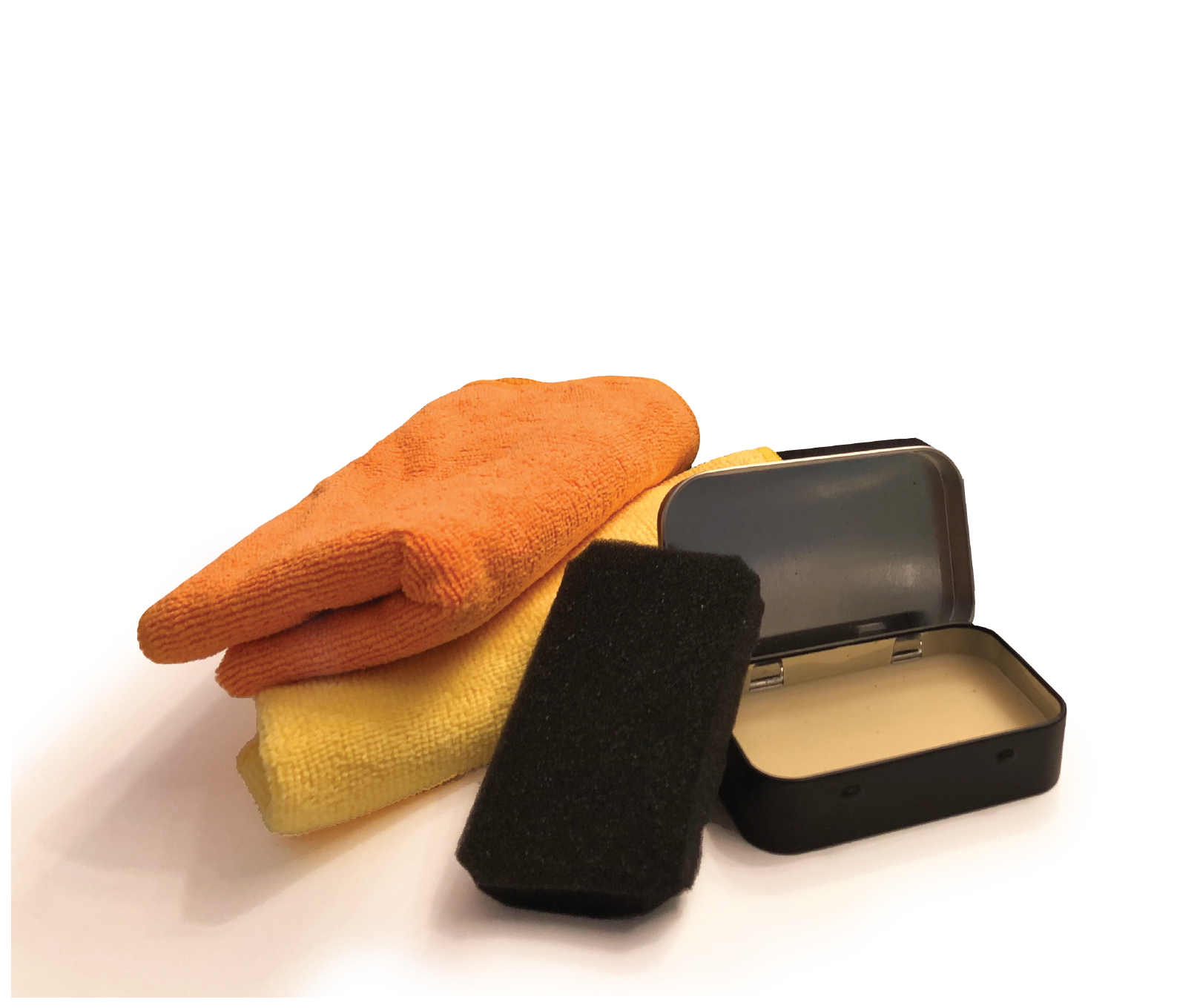
Products to package: soft cloths for cleaning and polishing, conditioner, and a sponge for applying it.
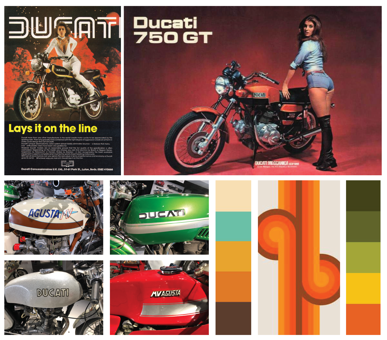
Many of the motorcycles on display in the Silver Shotgun exhibit were Ducatis. The bikes and their advertisements served as inspiration for this project.

A list of possible names for the fictional leather goods company, drawing on history, daring, and a sense of adventure. The top contenders are underlined, but eventually (after sketching all of them, below) Leadfoot Leather Goods won out.

Hand-lettering sketches of a few possible names, inspired by the funky, organic typography of the 1970s.
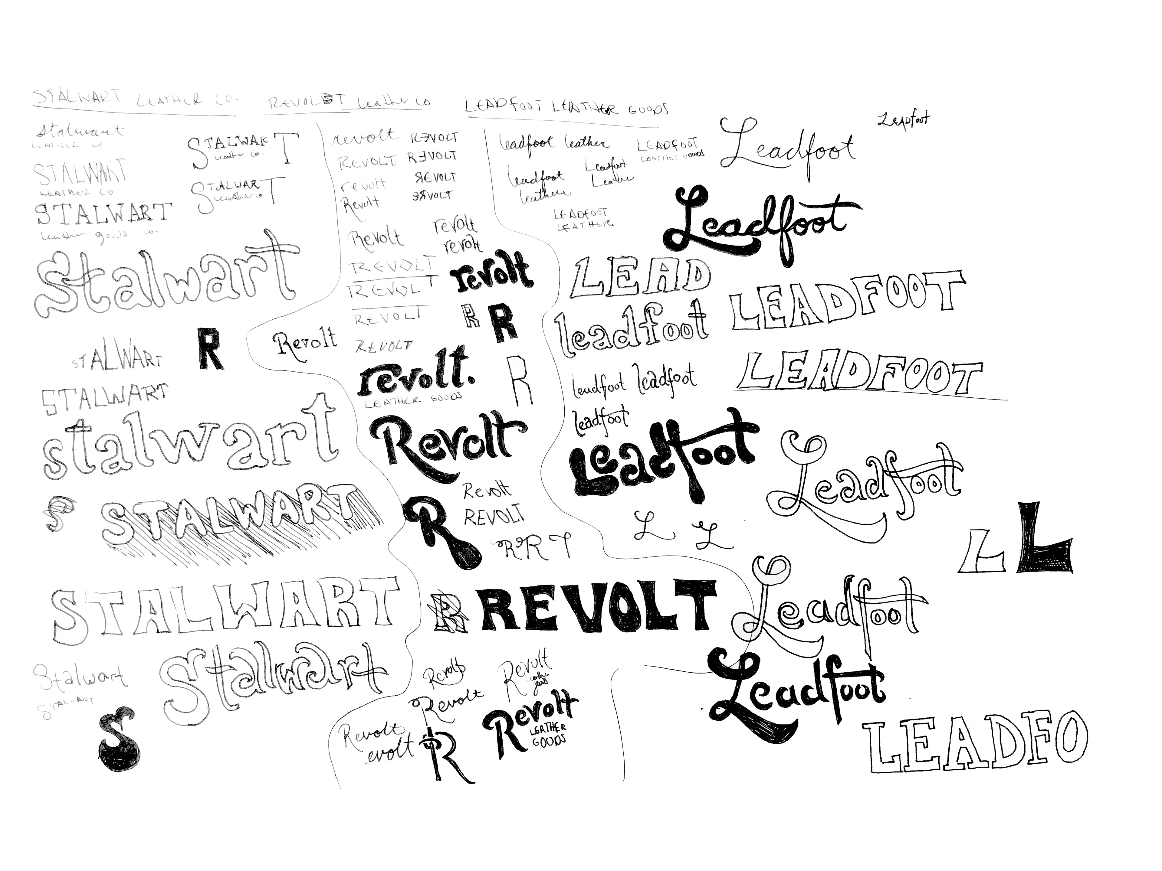
These sketches led to the realization that "Leadfoot Leather Goods" rolls off the tongue nicely, and it was chosen for the brand name.

The hand-lettering didn't quite feel right, so these initial type studies for the Leadfoot logo took a different direction and referenced the source material more closely. Fenwick Outline (second column from left) was the winner, because it emulated some of the vintage Ducati ads. The sweeping "A" adds some character, and brings the eye right down to "leather goods" (set in Josefin Sans).
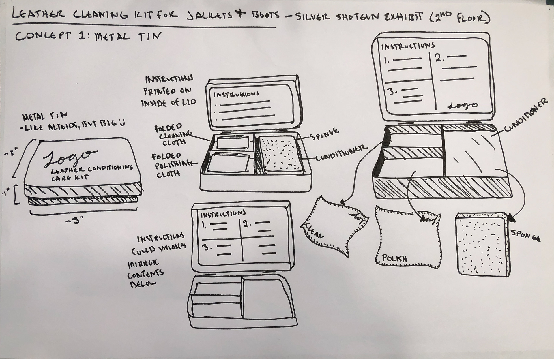
First sketch for primary packaging: a large tin, with each component fit together and a lid that snaps shut—it was apparent from the beginning this packaging needed to be self-contained, easily thrown in a bag.
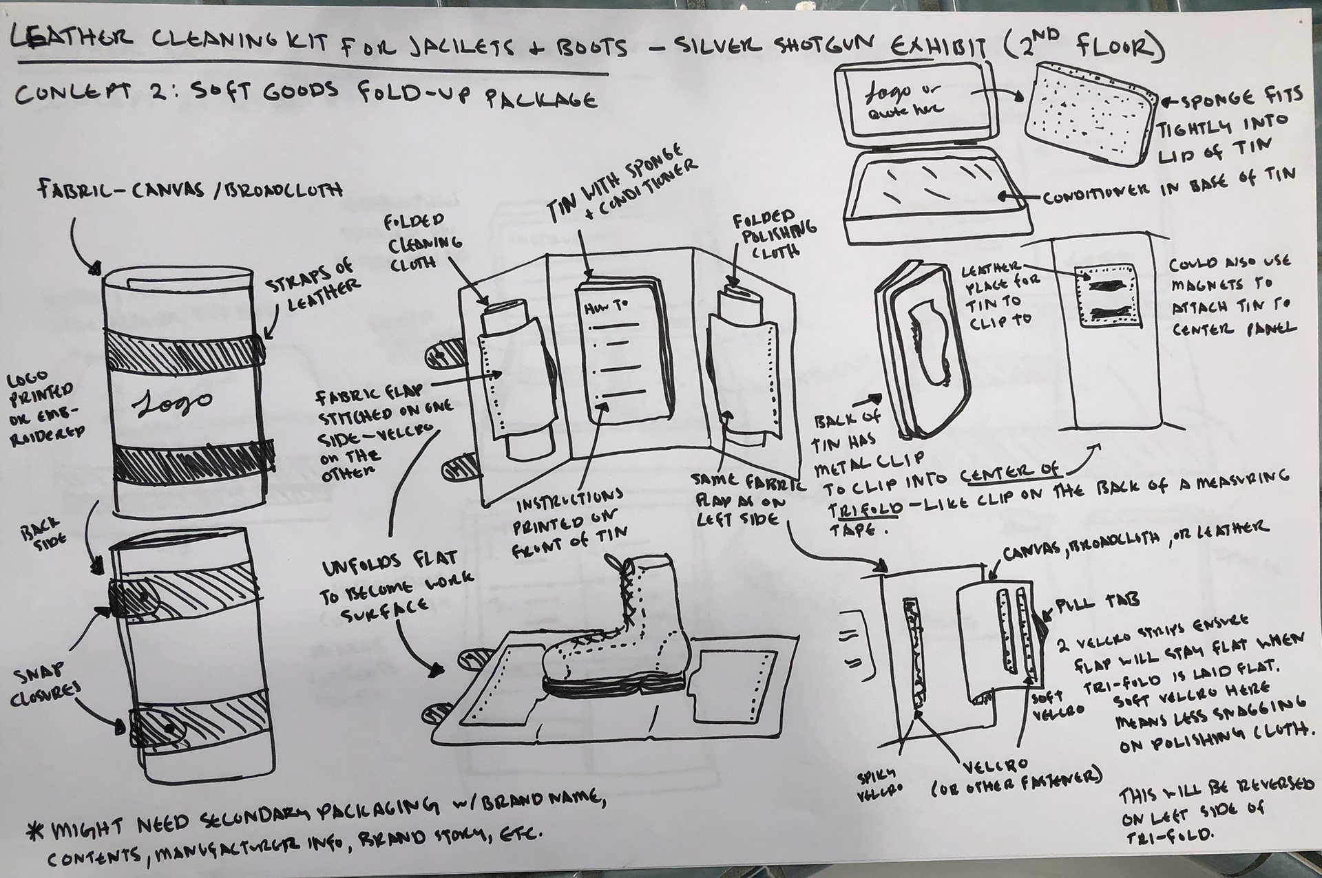
The tin felt a little too safe, so this sketch shows idea of a soft-goods package. In the end, the two straps on the outside were swapped for one and some of the fasteners on the interior were changed. Secondary packaging was needed to make this more shelf-ready, hence the added cardboard tube.
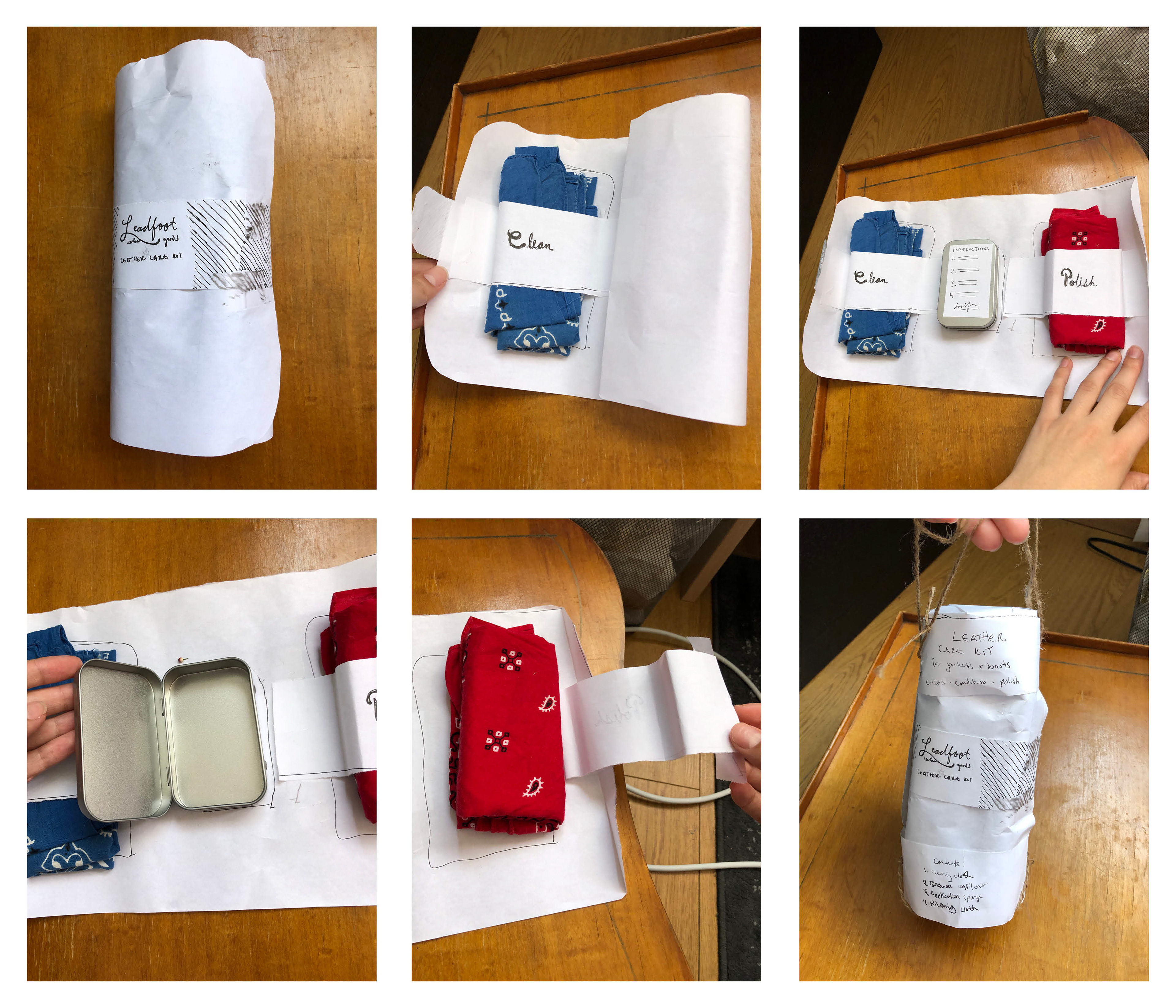
The first paper mockup of the roll-up case, and secondary packaging in the form of an outer case with a handle.
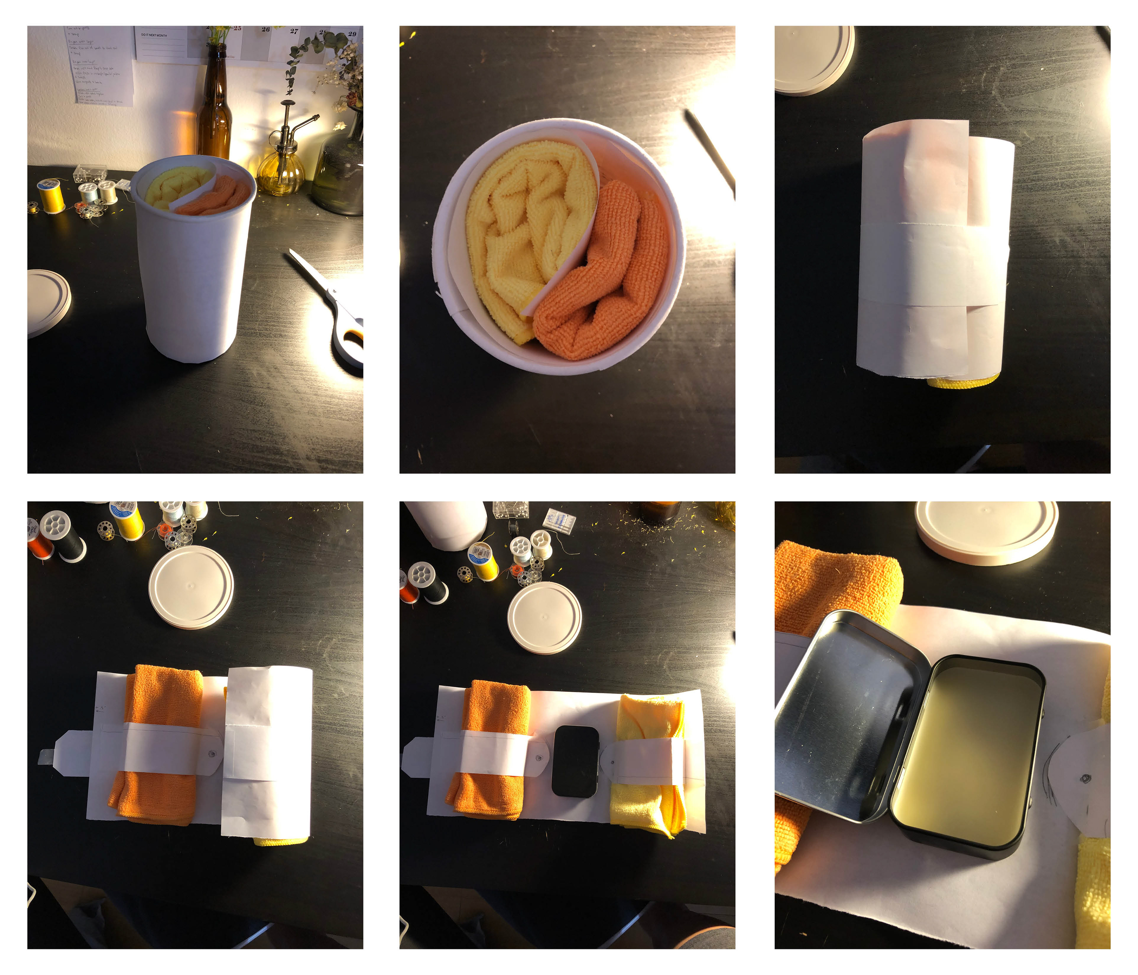
The second paper mockup, this time with final (blank) cardboard tube

Initial color studies, inspired by the bright colors of the motorcycles in the Silver Shotgun exhibit.
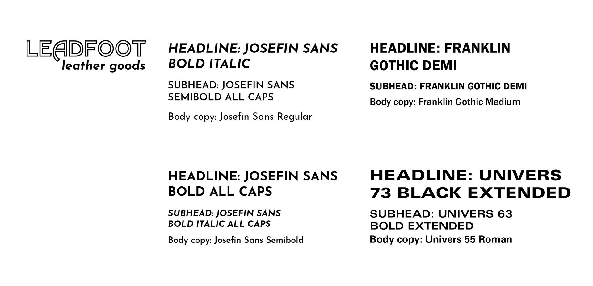
Type studies to see what would pair best with the logo for sell copy and other text on secondary packaging.
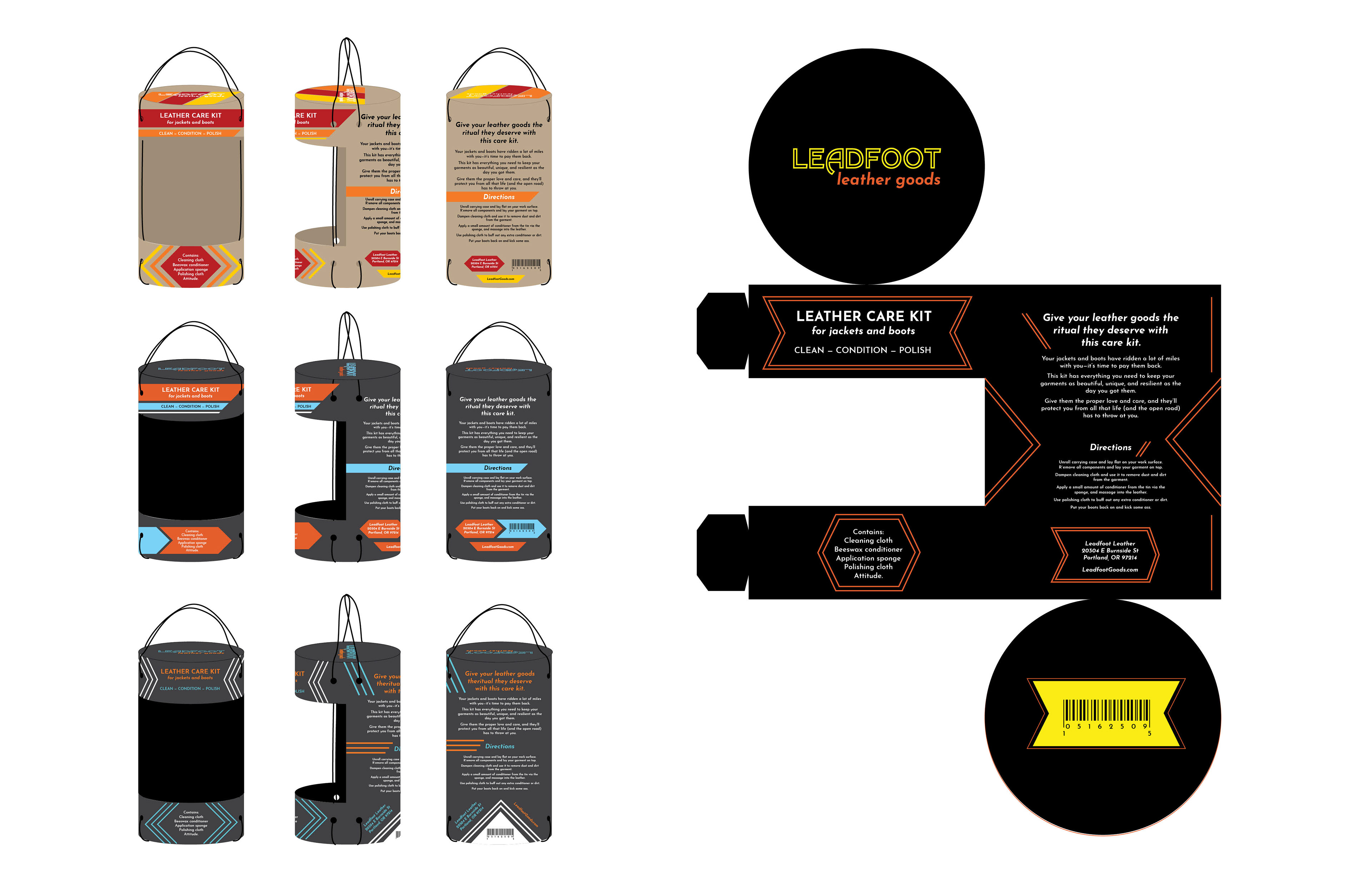
Color studies and a few layout variations for the first concept of secondary packaging, with the handle. The black, orange, and yellow color palette worked the best.

Final label design for the exterior of the cardboard tube. The double lines take their cue from the outlined type in the logo, as well as road stripes; repetitions of angles add dynamic interest.
Further final designs for the lid, and inside bottom of the tube.

The color palette and logo were continued on the inside of the tube and the lid with this pattern, which felt a little retro and continued the design from the outside.