
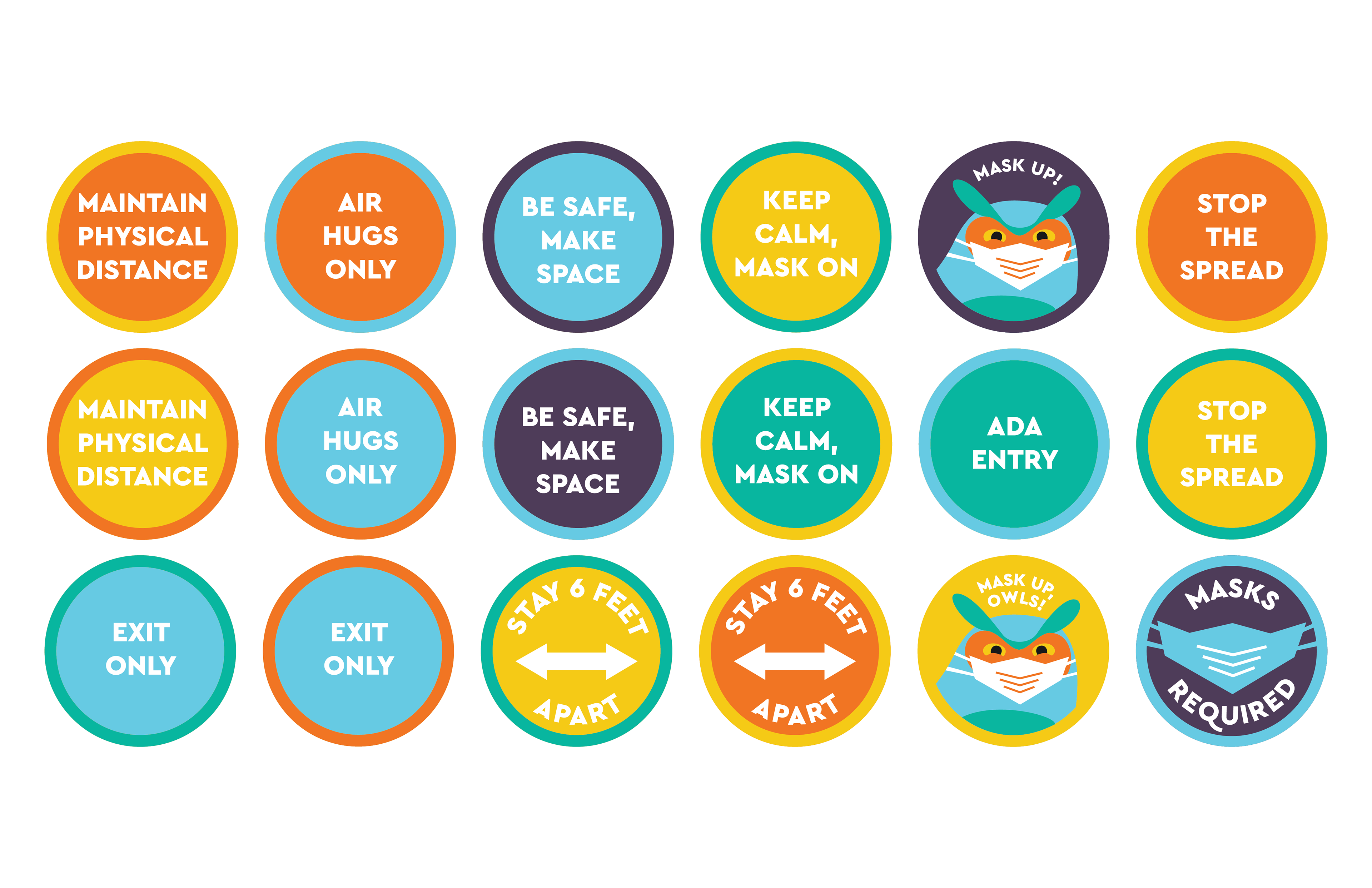
This friendly mask-wearing owl appeared in multiple places in the signage system.

Mockup of the graphics for the entrance of the Woodbury School of Business building. The signs on the door remind those entering to wear a mask and remain six feet apart; the one on the right is a simple map of the building to show where the entrances and exits of the building are.

Mockup of the exit door of the School of Business. The graphic frame created around the exit and entrance doors are similar, but different enough to help visitors understand which door to enter through.
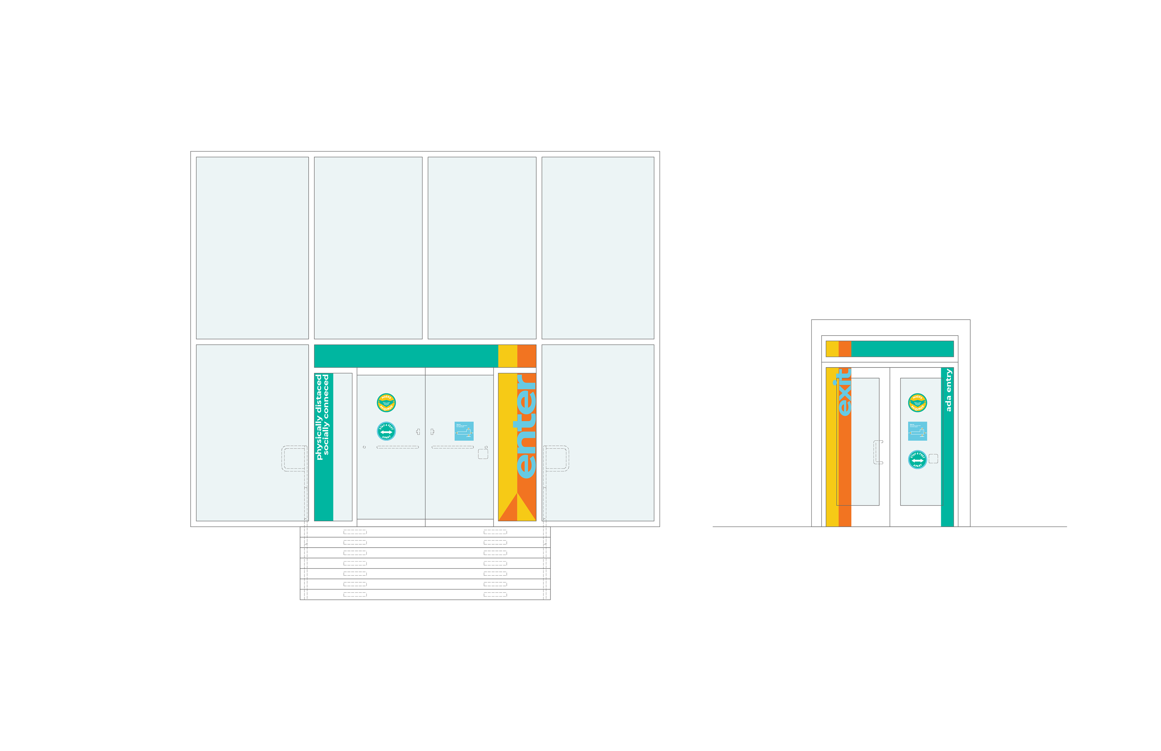
Elevation view of the entrance and exit doors.
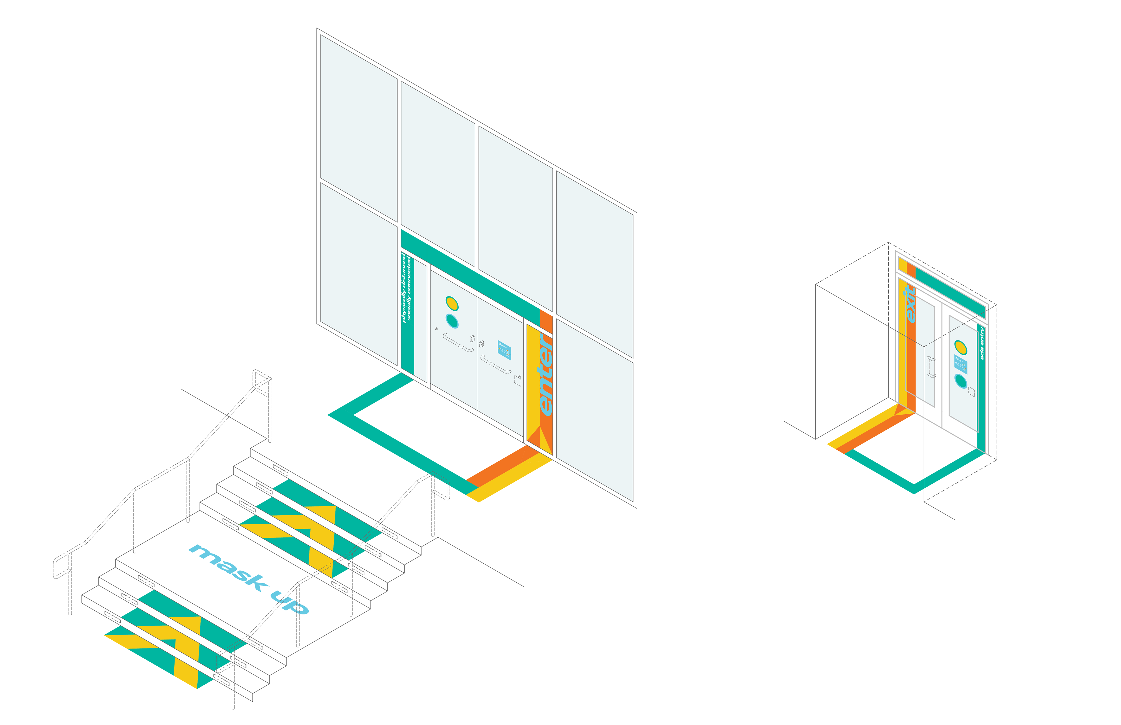
Axiomatic view of the entrance and exit doors, plus the stairs leading up to the front of the entrance.
A series of large floor graphics, to be applied to different intersections on the campus quad.

Mockup of one of the intersection designs.
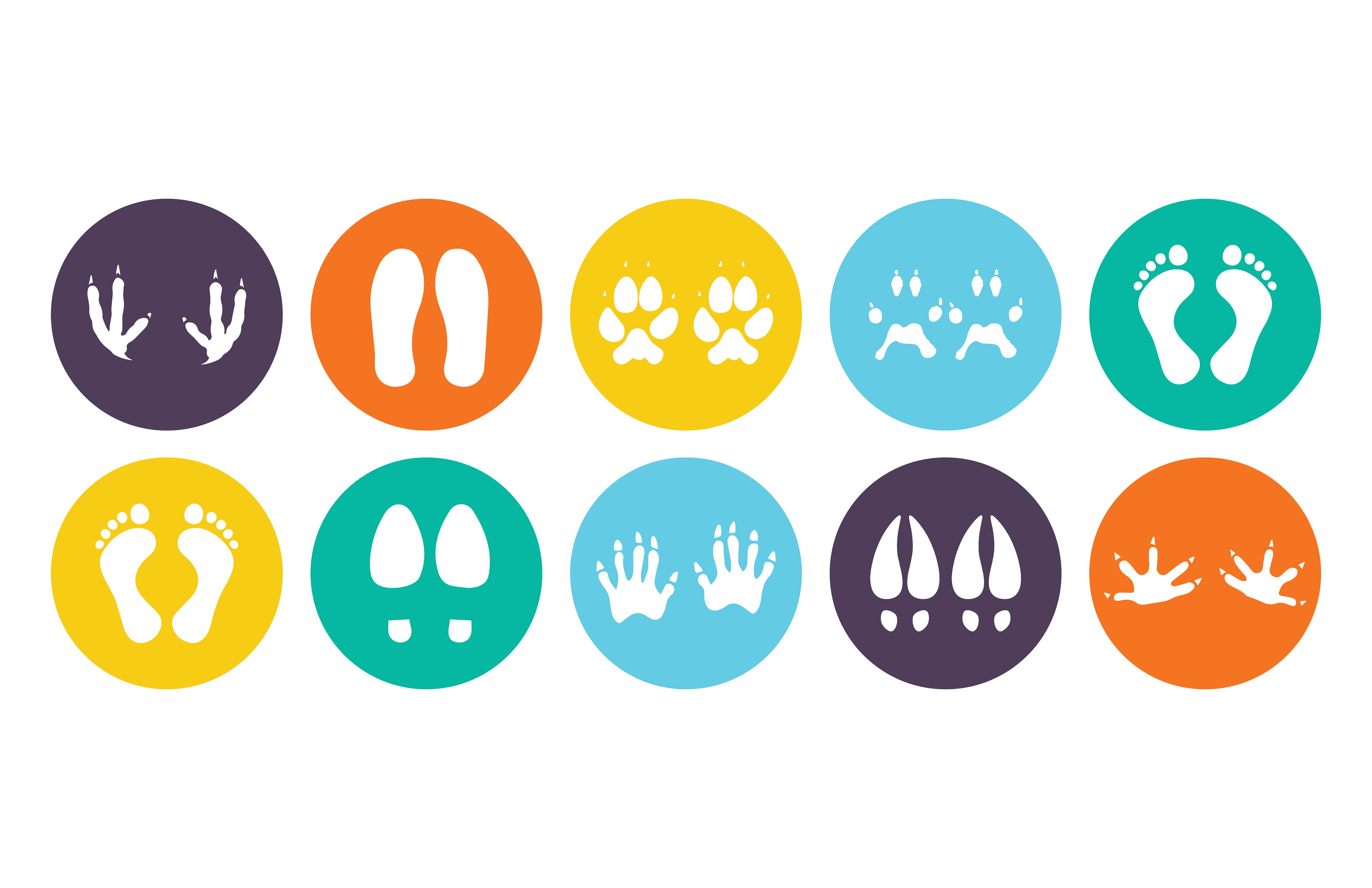
These footprints are based on wildlife commonly found on campus (including deer, possums, and squirrels), and are placed at the foot of benches and seating areas six feet apart to encourage physical distancing.

Mockup of the footprint signs in the environment.
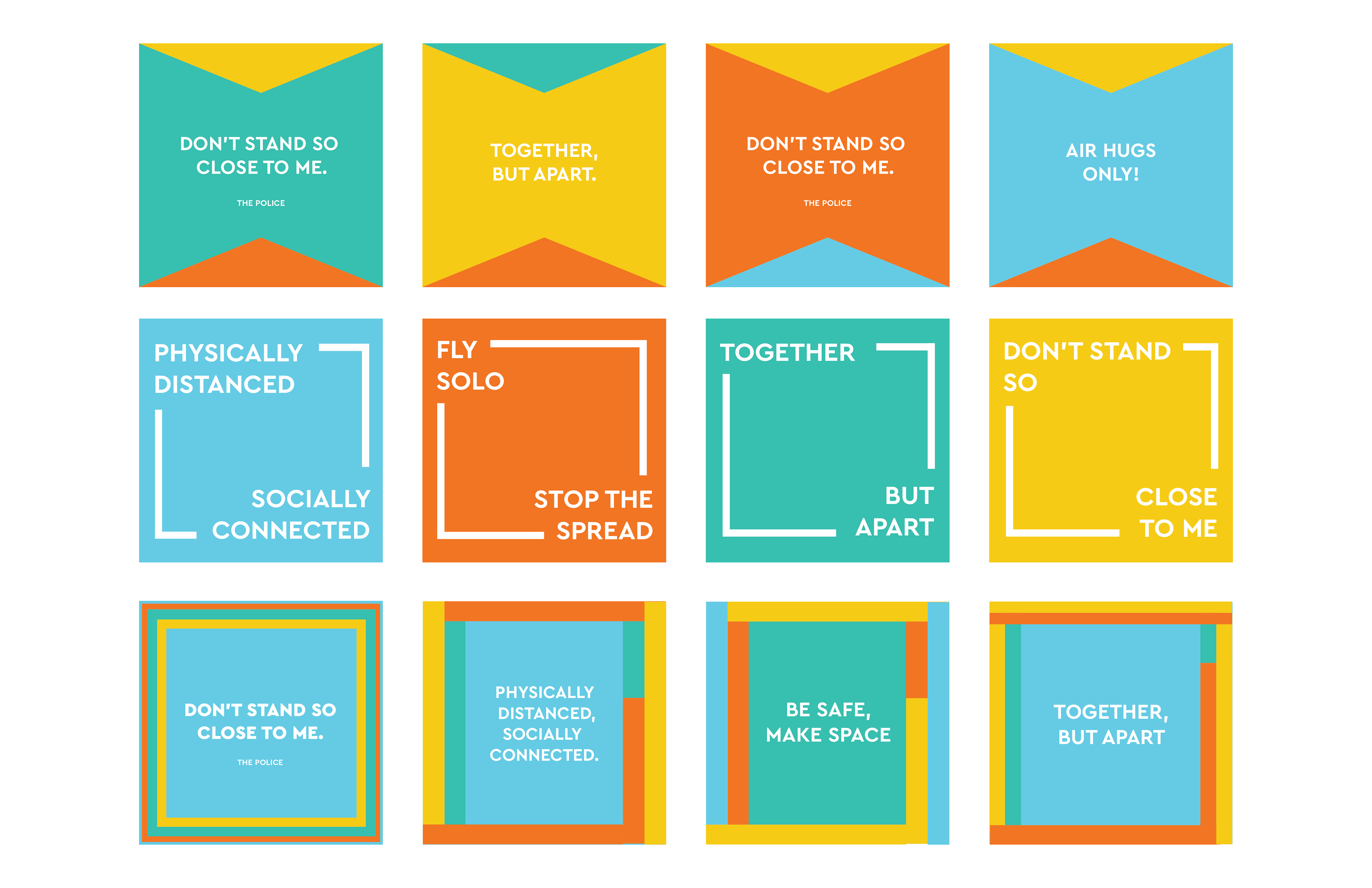
A series of wall signs with general reminders, to be applied all across campus.

Mockup of three of the wall signs.
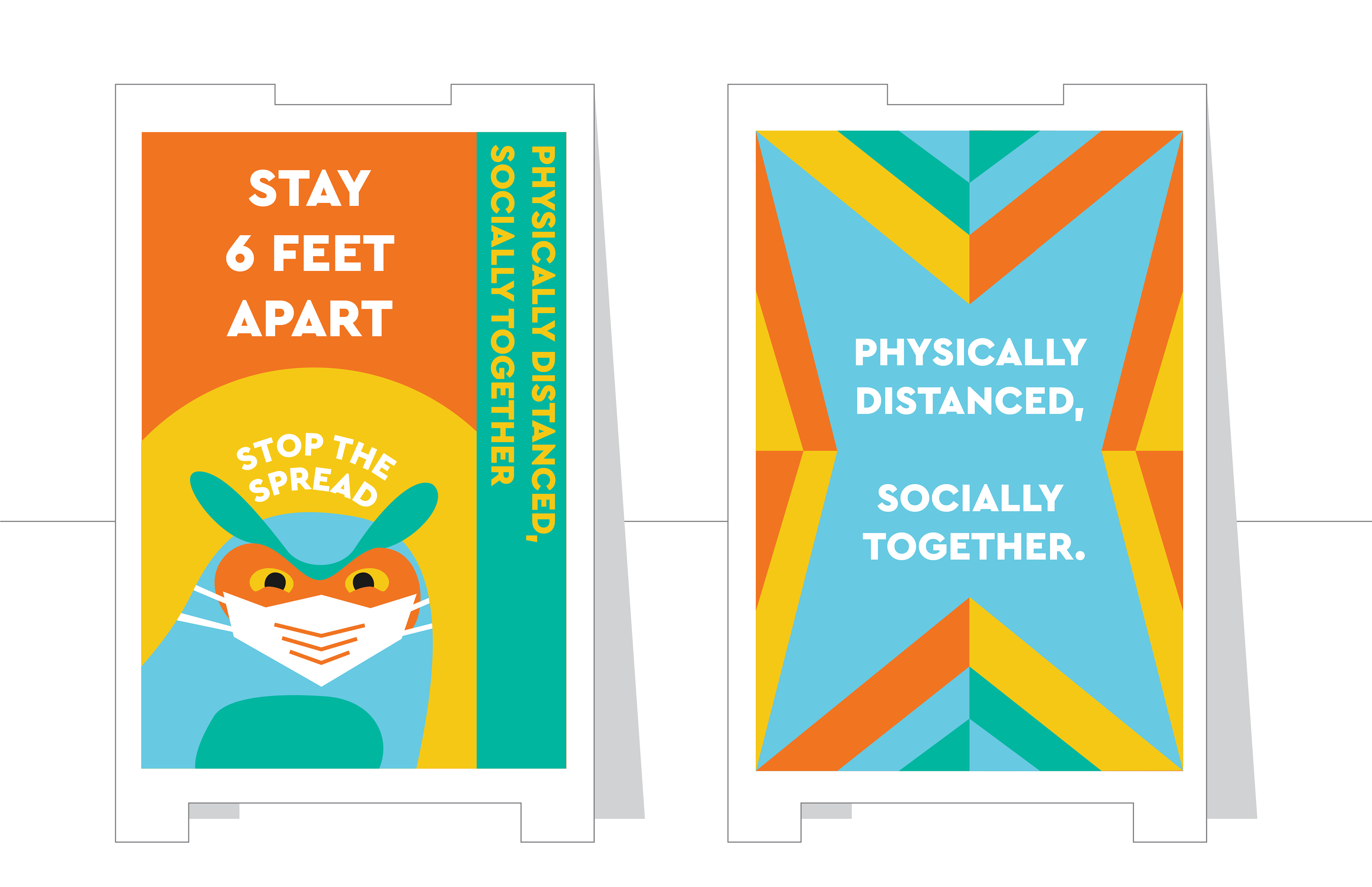
Sandwich boards carried the main message: keep your distance, but remain socially together, and keep our friends safe!
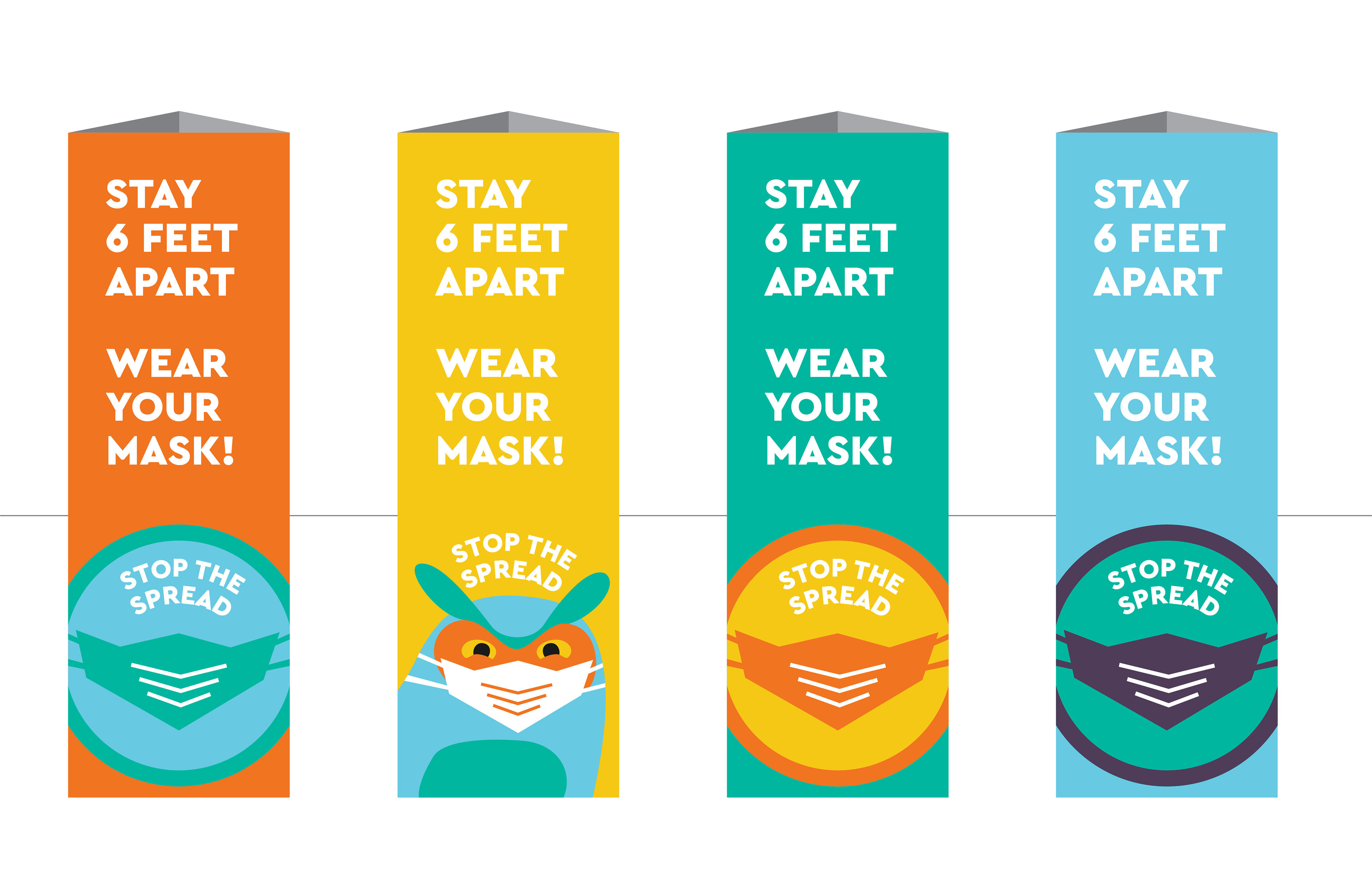
These trifold signs were meant to go around campus as additional messaging.

Series of one-way signs to help with directional messaging inside and outside of buildings with a one-way traffic pattern.
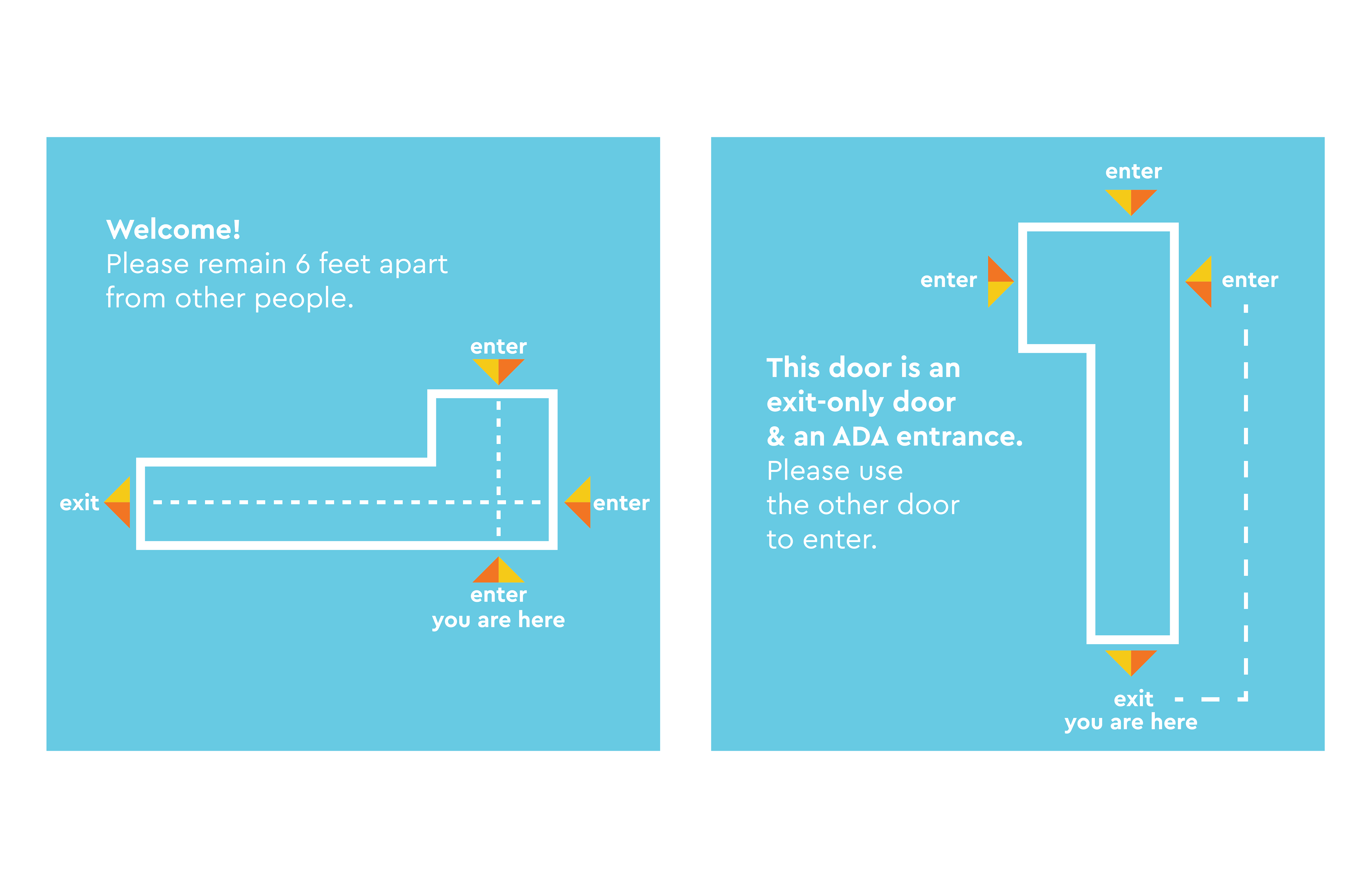
Maps for the entrance door (left) and exit door (right) of the School of Business building.

The simple style guide created for this project: six vibrant colors and a range of typography from Cera Pro.