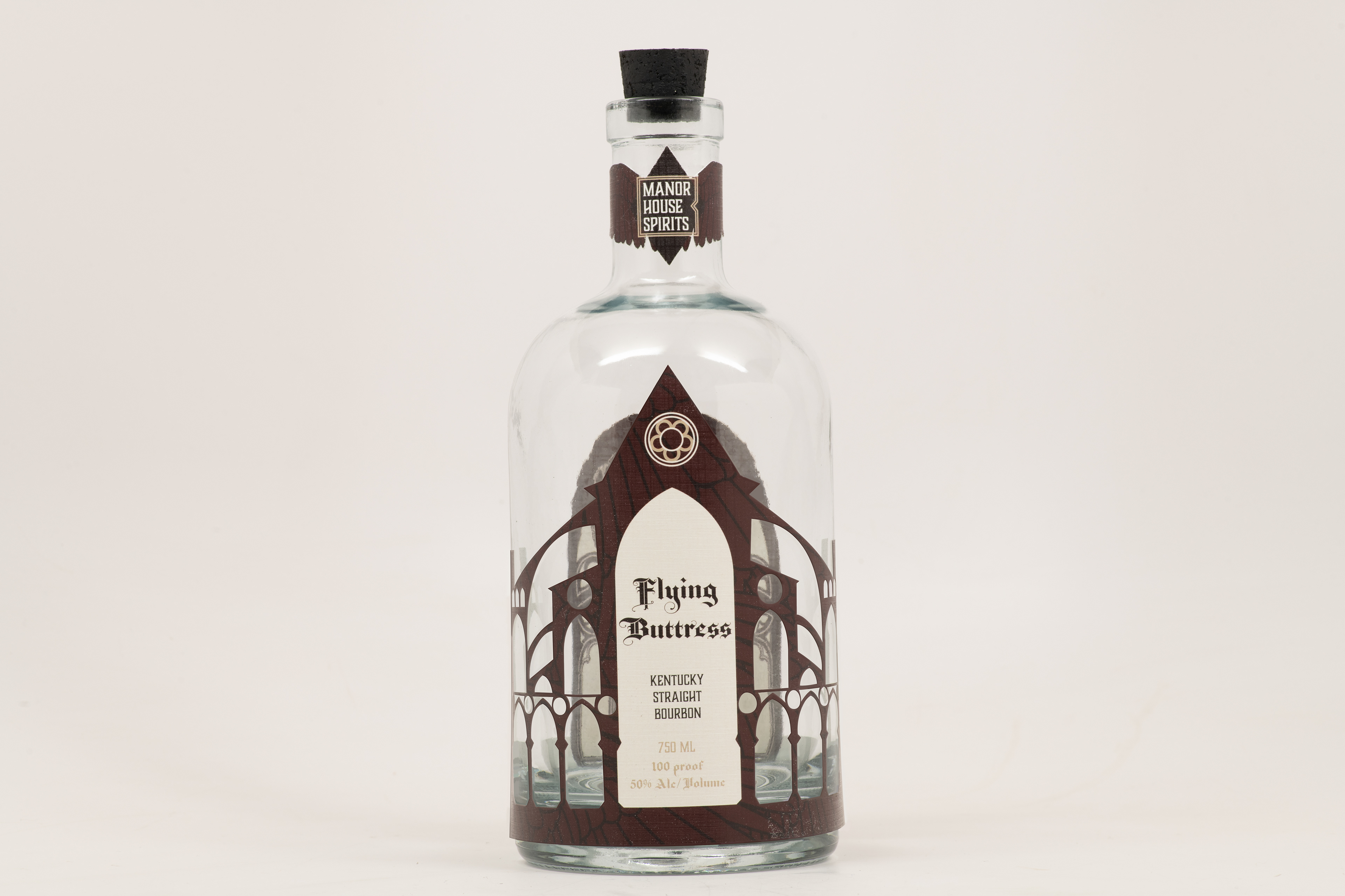
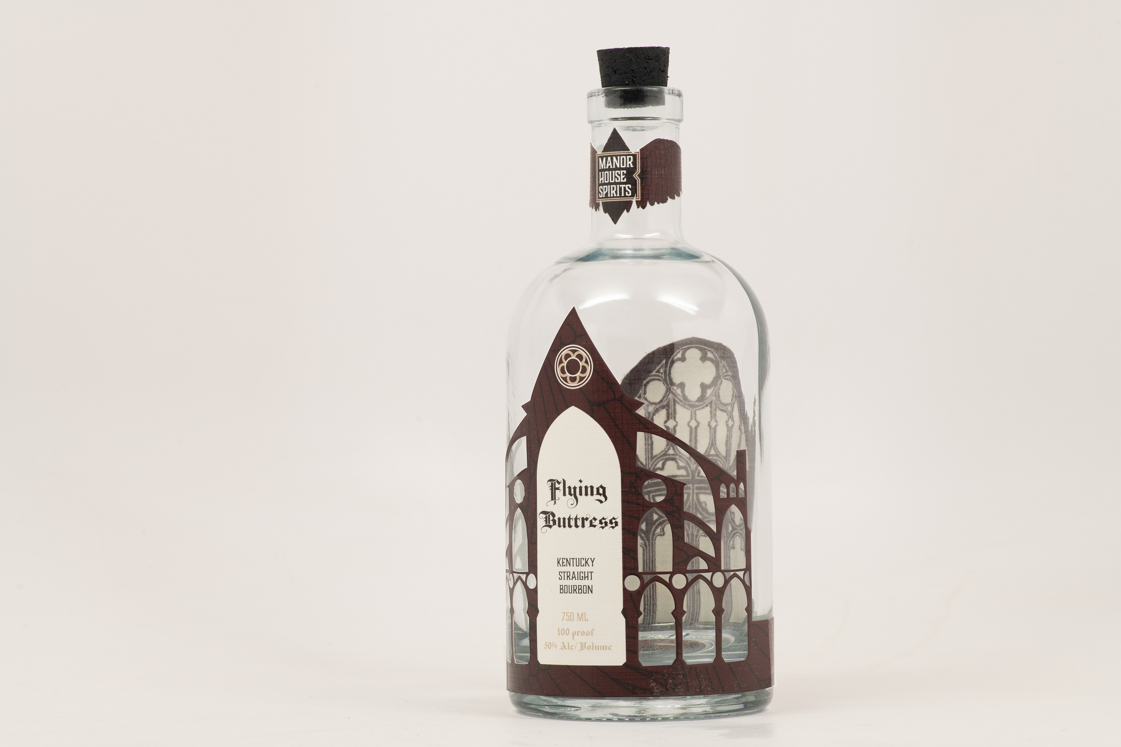
The front of the bottle, while empty, showcases the delicate nature of the Gothic architecture-inspired label. The neck band contains the logo of fictional parent company Manor House Spirits, and the raven wing motif carries through in the shape of the band.
When the bottle is empty, the inside of the back label is visible, with more Gothic imagery inspired by cathedral doors. The shape of the raven wings on the neck band label is more evident from the side.
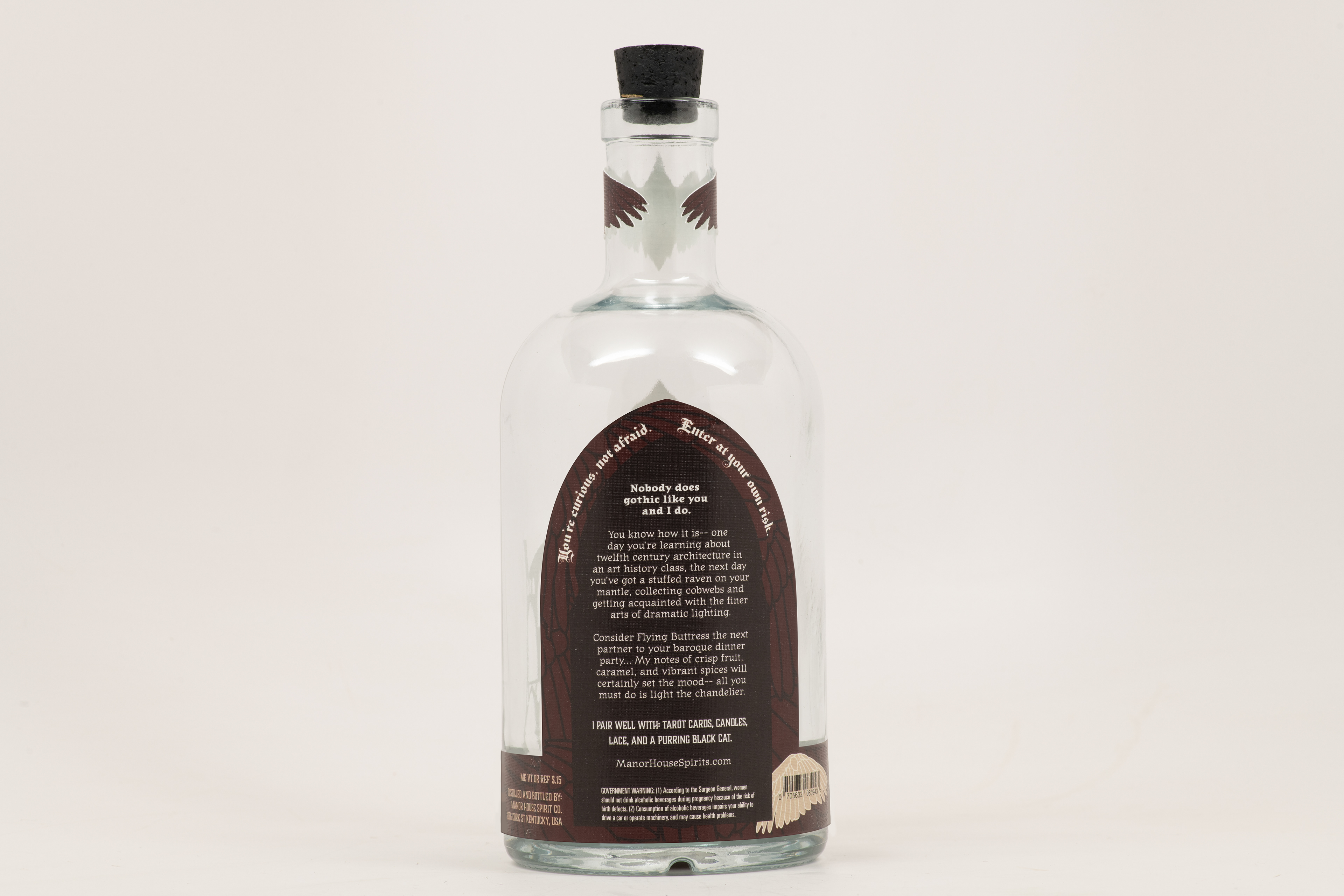
The back of the label is shaped like a door, and contains the brand story and information about the flavor profile of Flying Buttress. One raven wing is tan instead of red, to allow the barcode to be scanned.
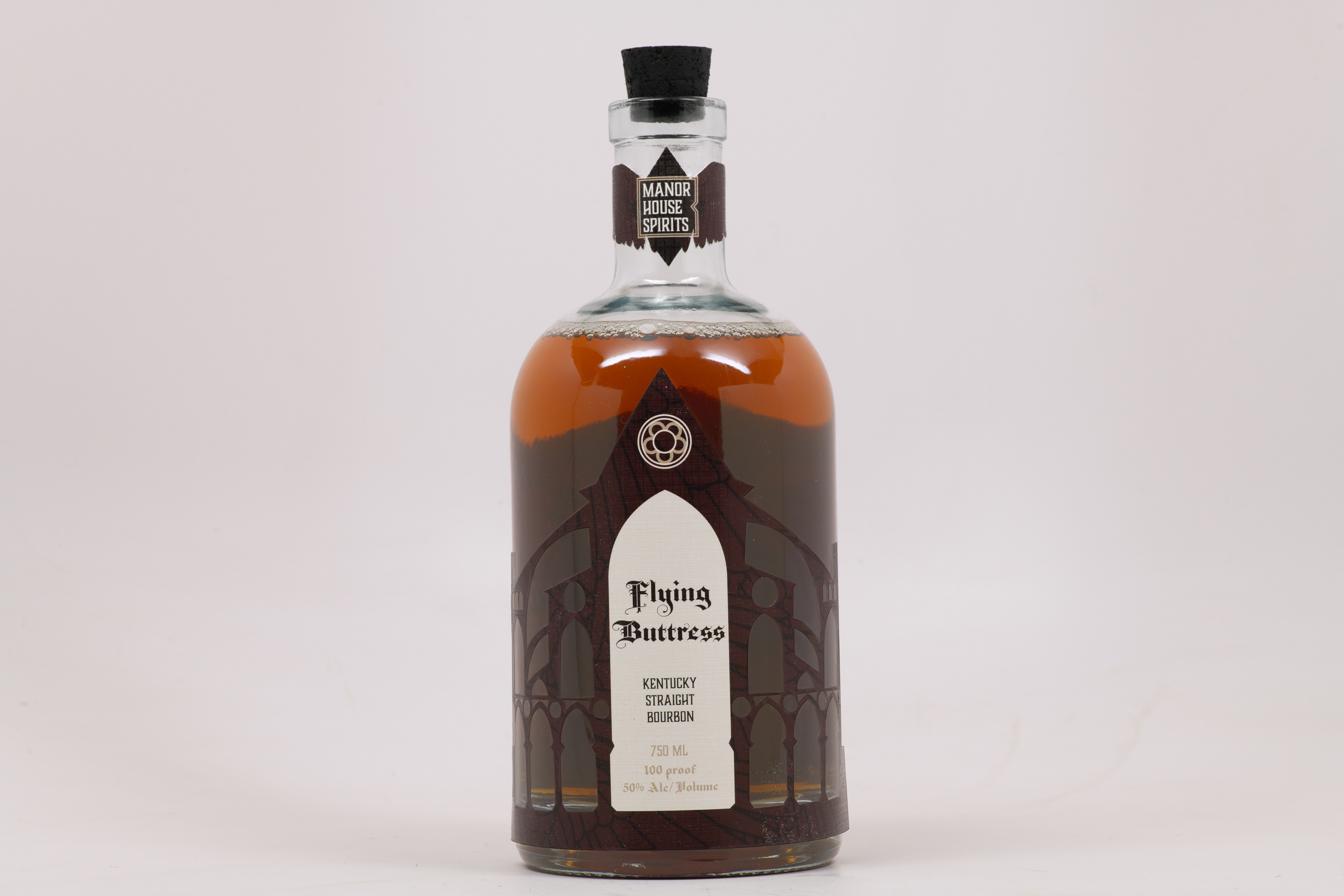
Final front label with bottle full of whiskey.
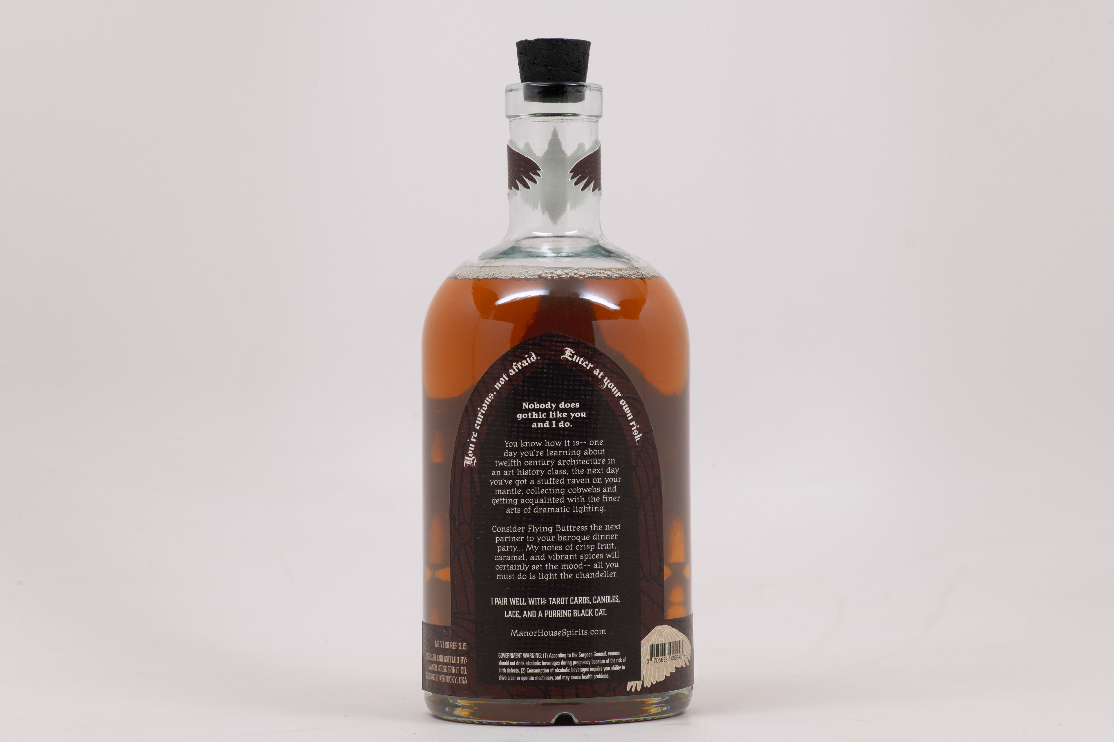
Final back label with bottle full of whiskey.
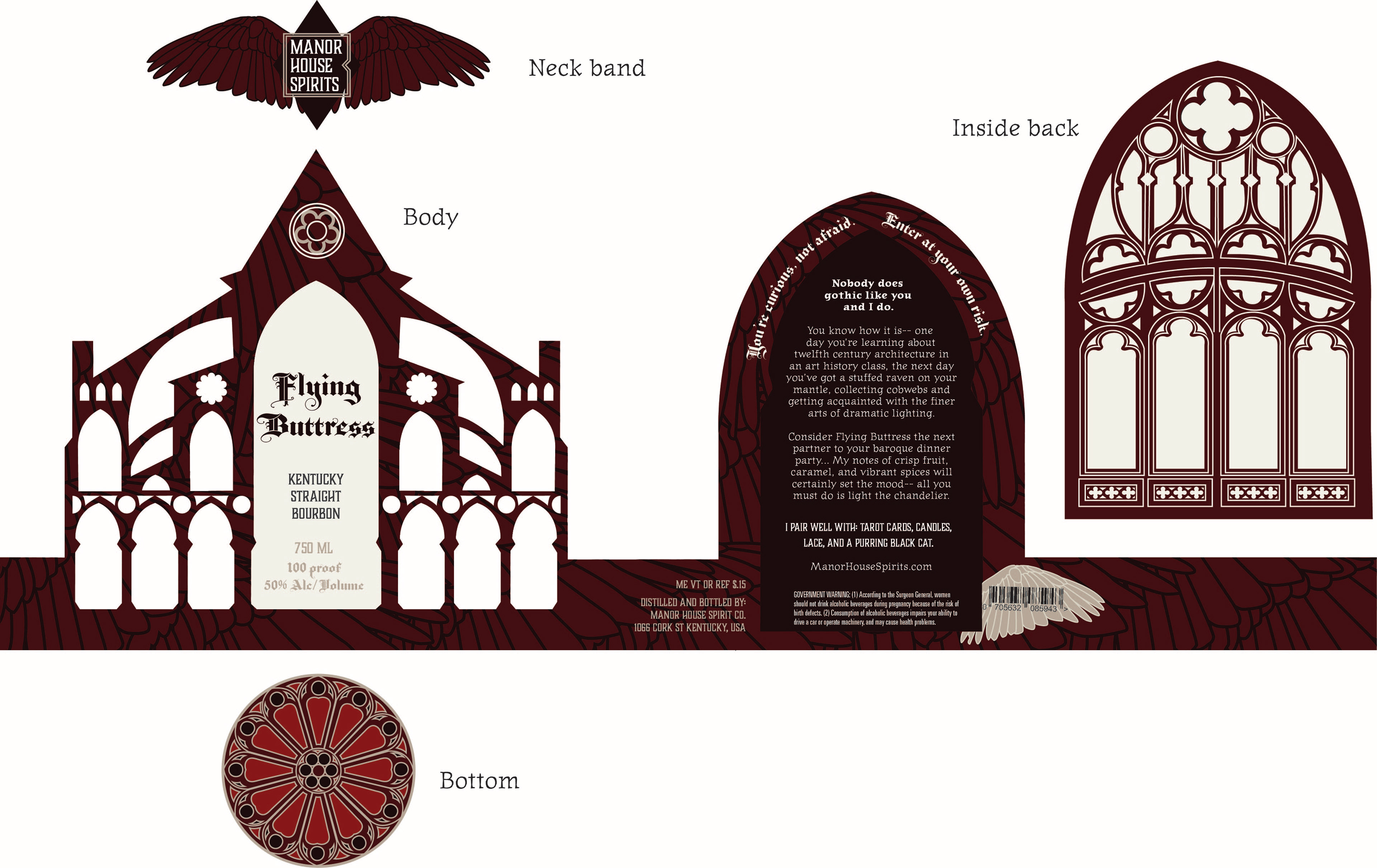
Final label for front, back, inside back, neck band, and sticker on the bottom of the bottle, which is reminiscent of Gothic cathedral windows.
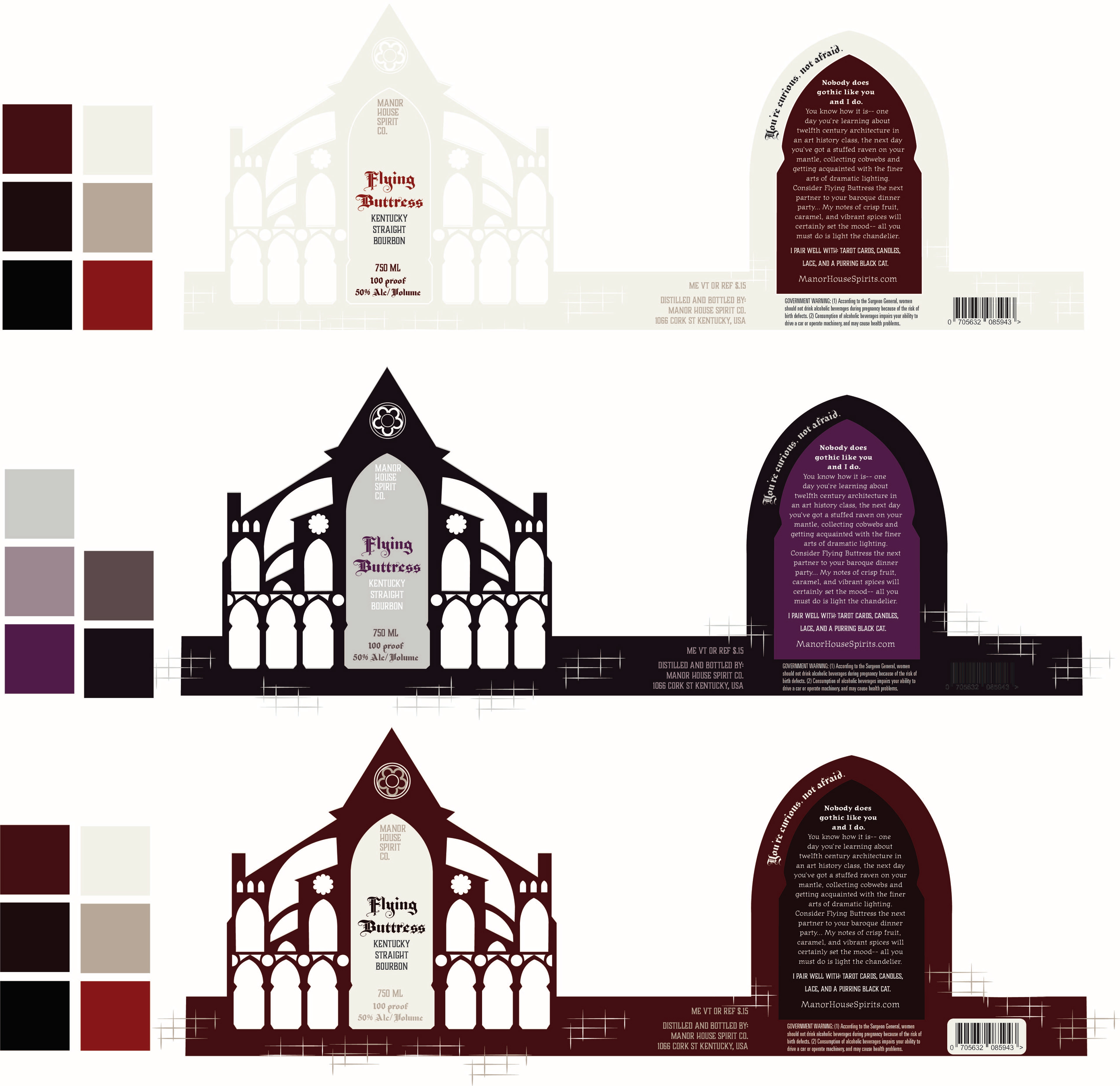
Earlier color studies for the Flying Buttress label.
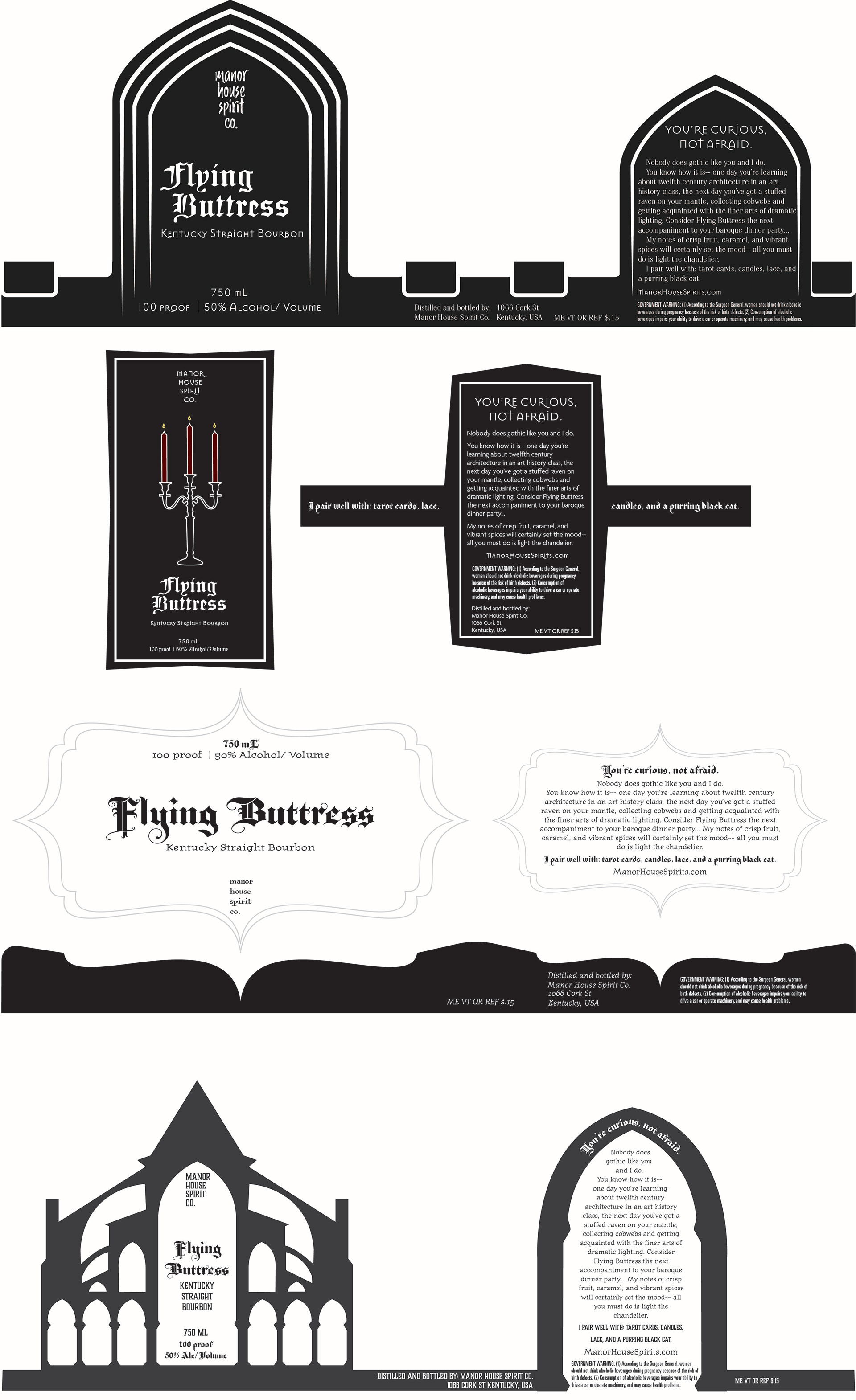
Early concepts for different label shapes and styles.
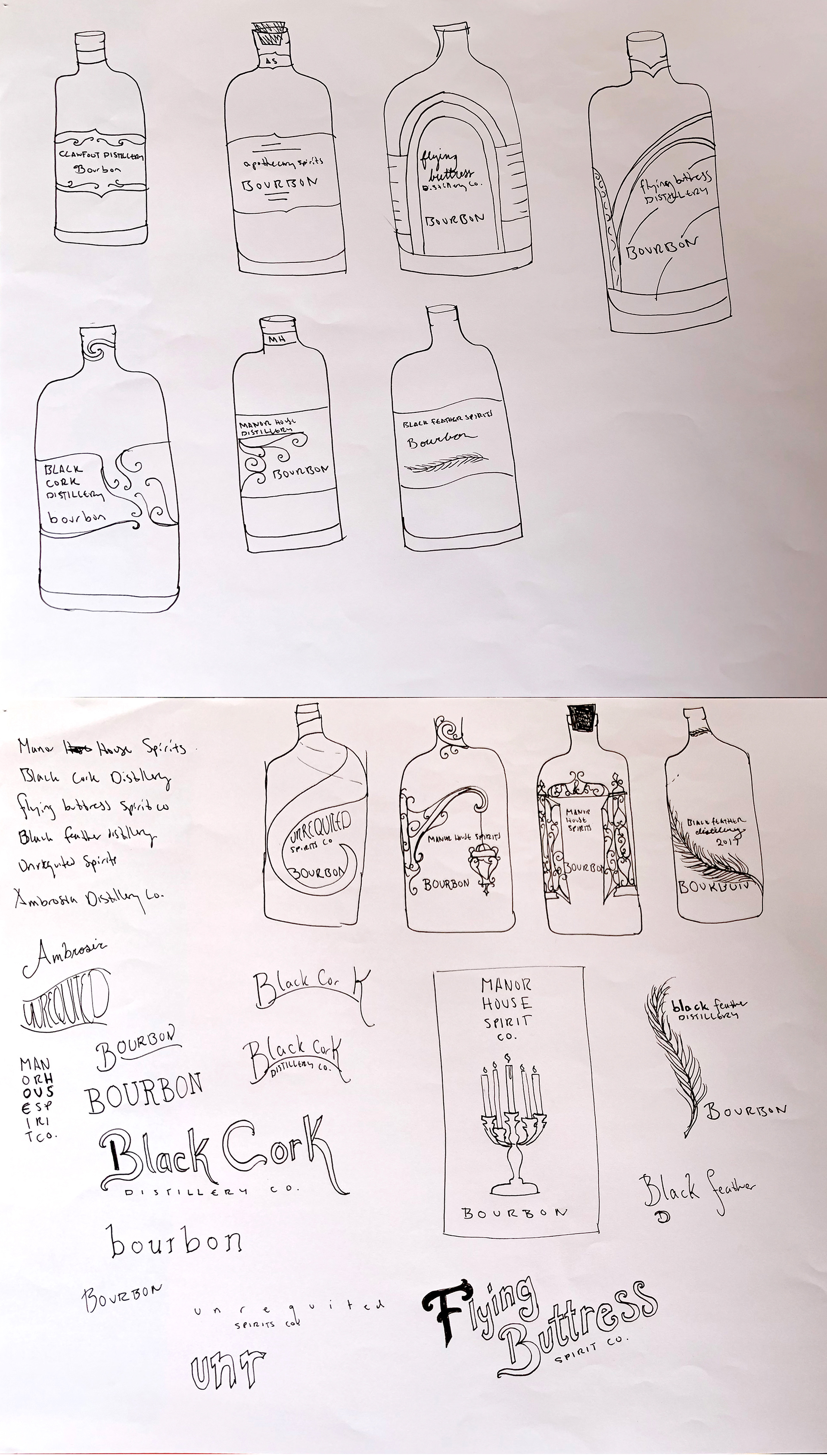
Sketches for label shapes and typography.
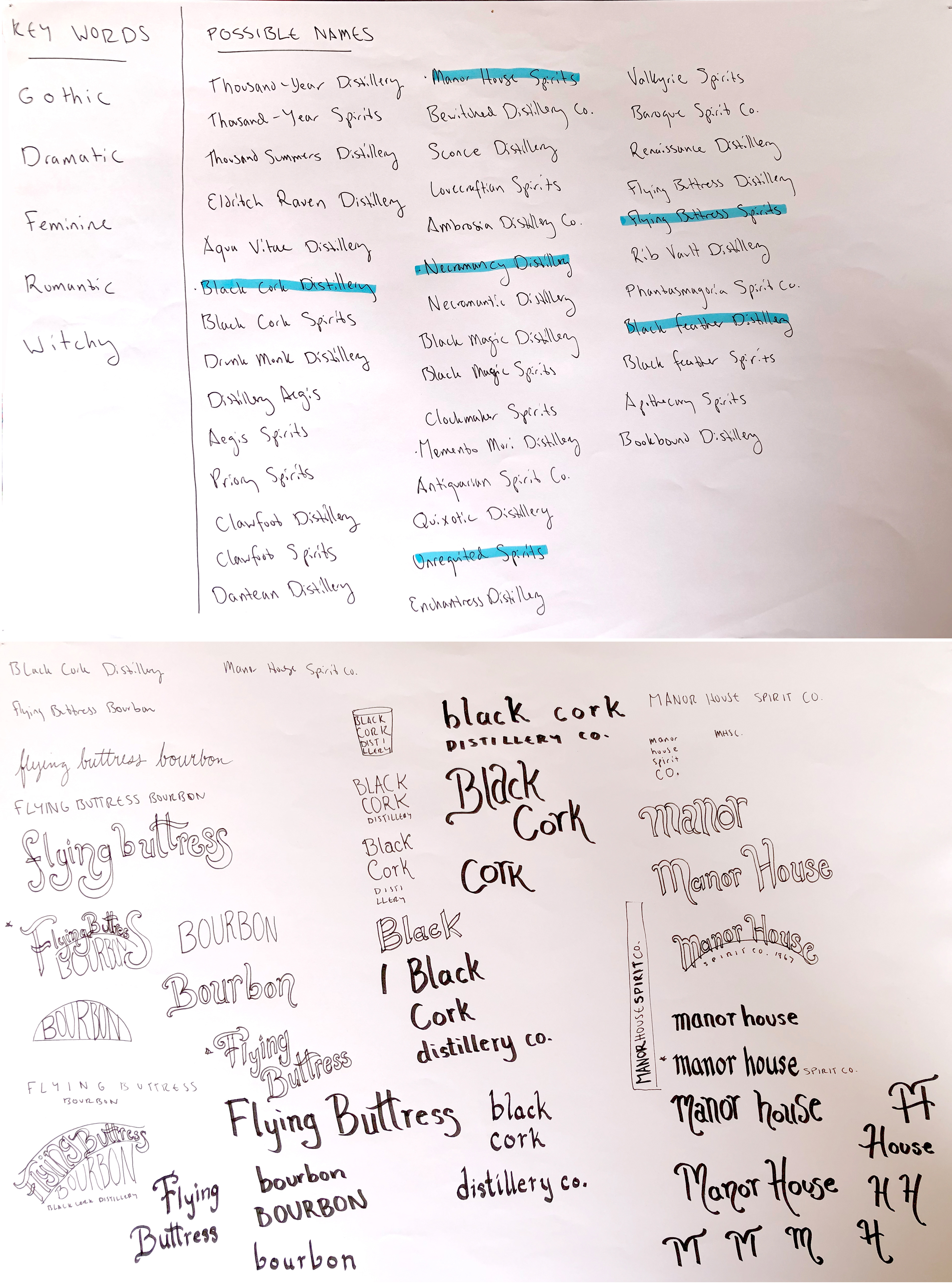
List of possible names, and hand-drawn type studies to explore possibilities of style.
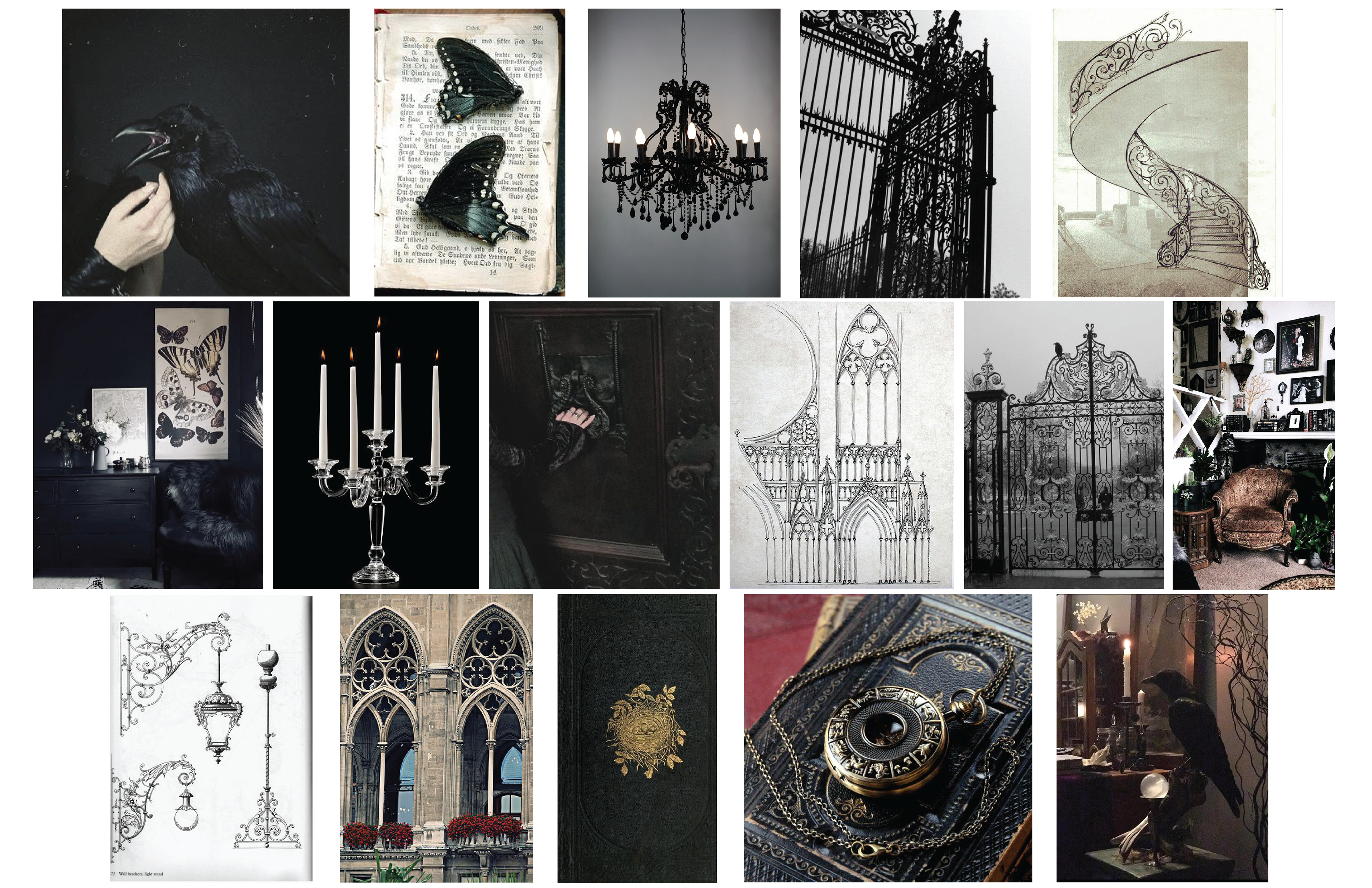
Moodboards such as this one helped cultivate the aesthetic of Flying Buttress and determine the target audience.