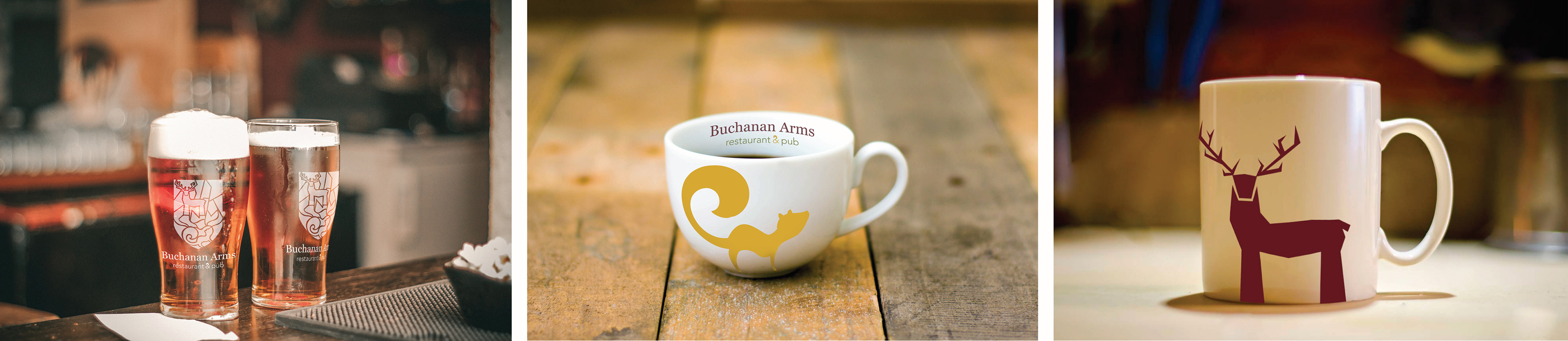
The logo could potentially be applied to pint glasses via etching. The squirrel and deer could also be painted on teacups and coffee mugs, respectively; the curves of the cup complement the shape of the squirrel while the straight sides of the mug complement that of the deer.
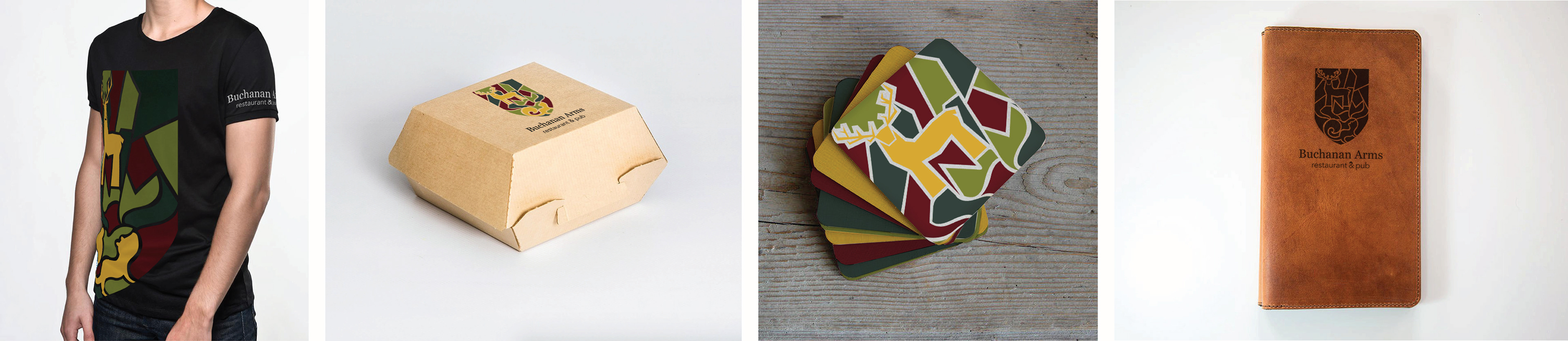
The logo could be made into a t-shirt, printed on a to-go box, printed on coasters, and burned or embossed into a leather menu cover.
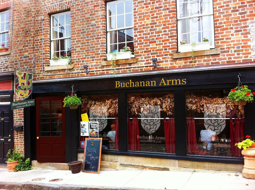
This mockup of a potential new exterior for the Buchanan Arms includes the name painted on the wood lintel in the style of traditional British pubs. The logo is applied to the chalkboard by the door and etched onto the windows, and the sign hangs perpendicular to the wall, similar to traditional pub signage.
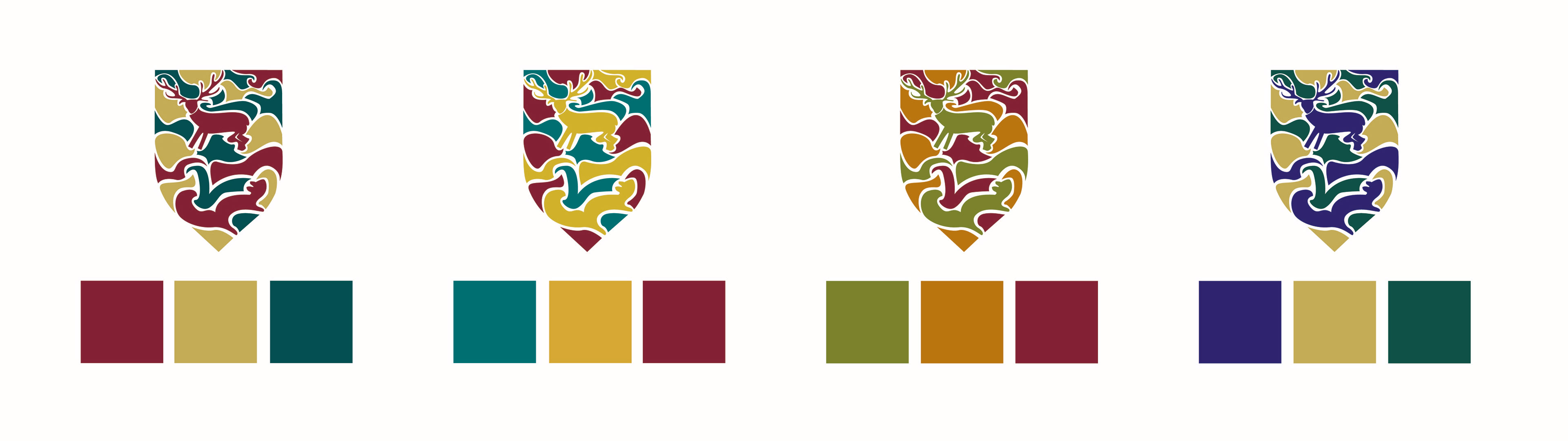
Refined color studies on the shield logo mark explored different options for colors and their placement. Eventually, a combination of the first and third palettes here was used.
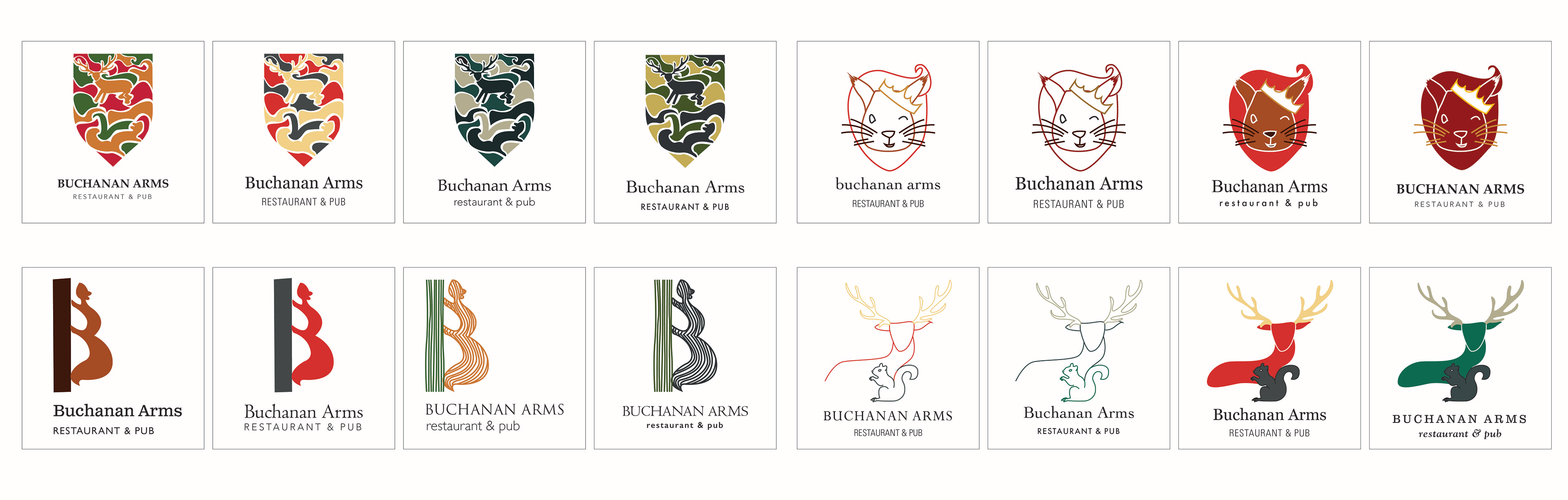
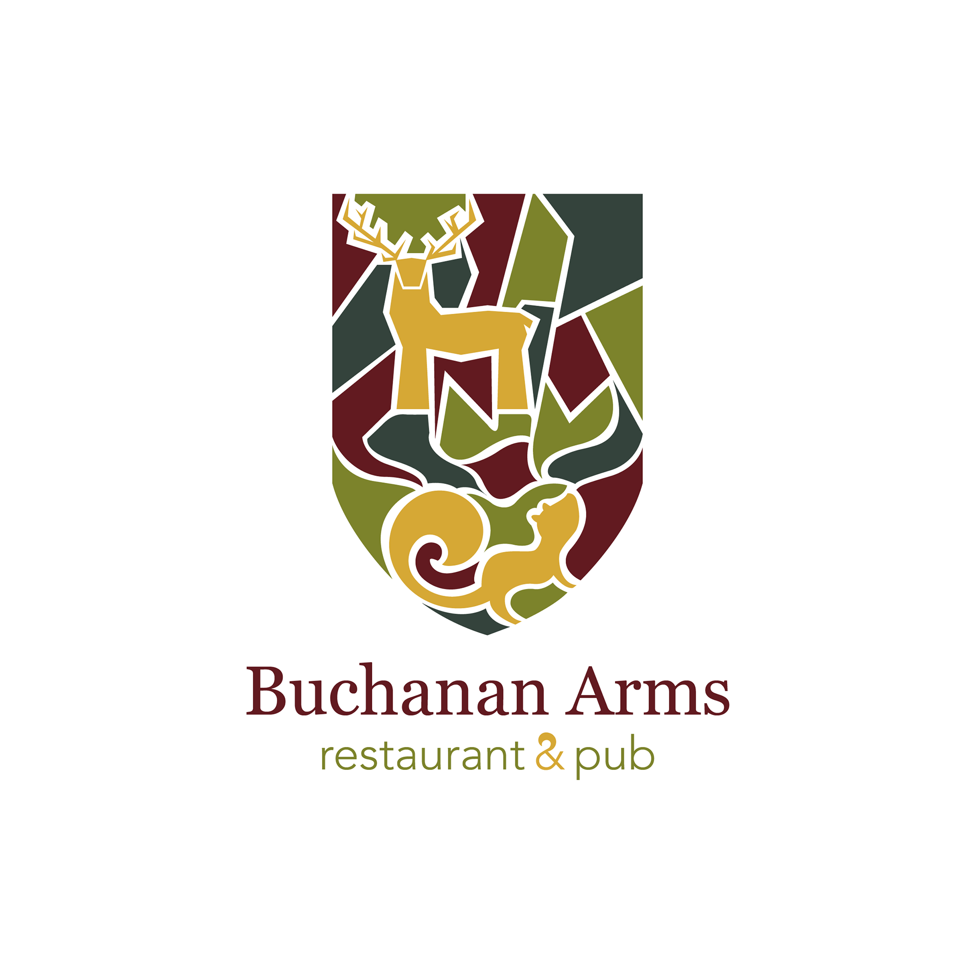
Color and type studies of four different marks. Some seemed to work as line art as well as solid shapes, so both options were tried. Eventually, the top left shield-shaped mark was chosen for further development.
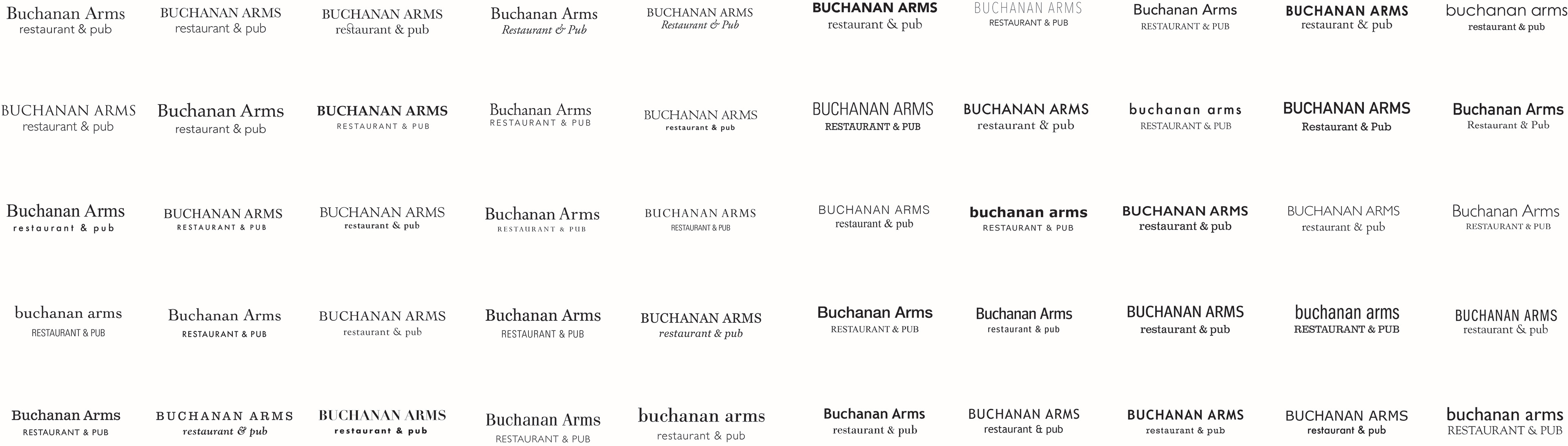
Type studies experimenting with combinations of serif and sans-serif typefaces. The 25 on the left use various serif fonts for "Buchanan Arms" with sans-serif fonts used for "restaurant & pub." The 25 on the right are vice versa.
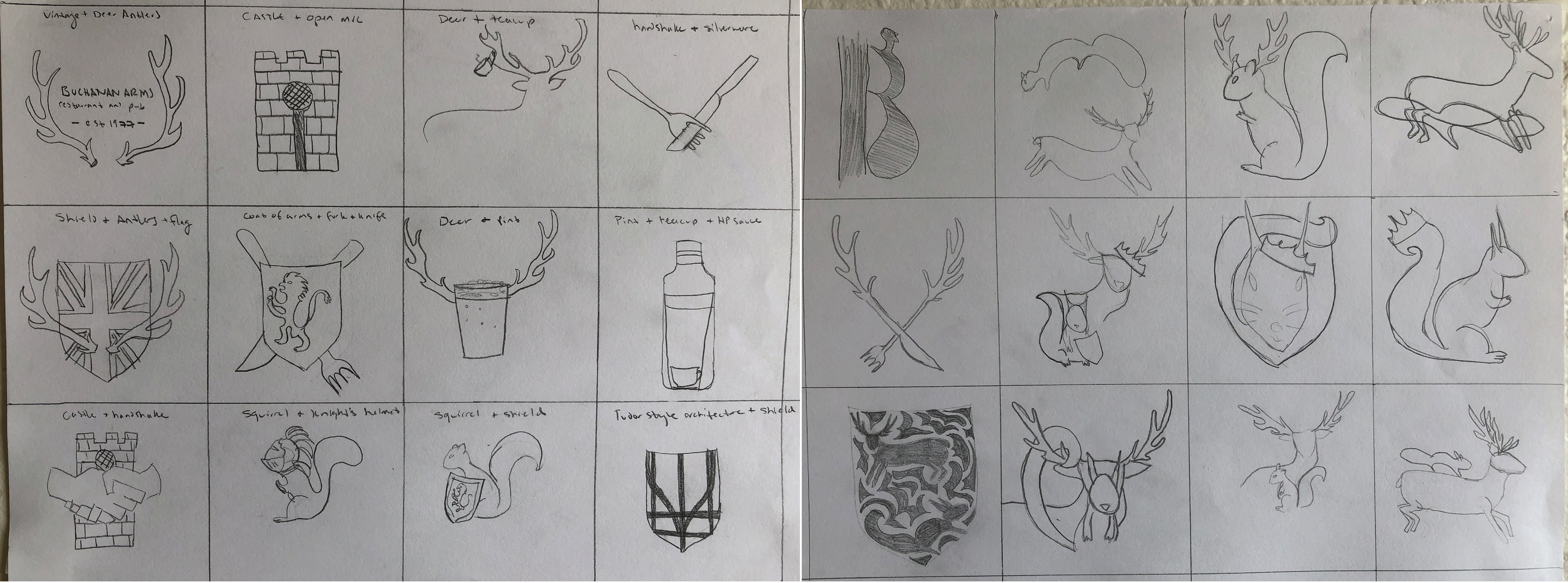
The first set of sketches, combining various elements of the deer, squirrel, shield, pub life, and England.
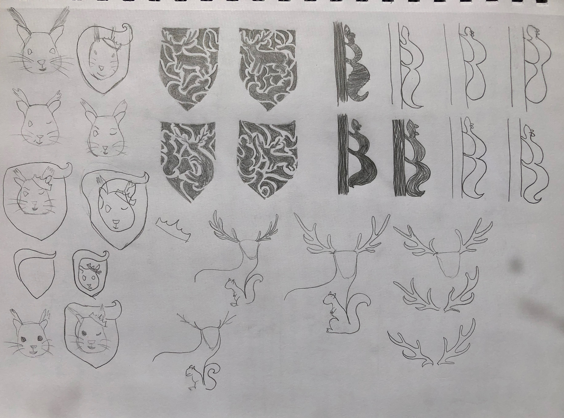
Refined sketches working with the deer and squirrel, which led into further color studies.