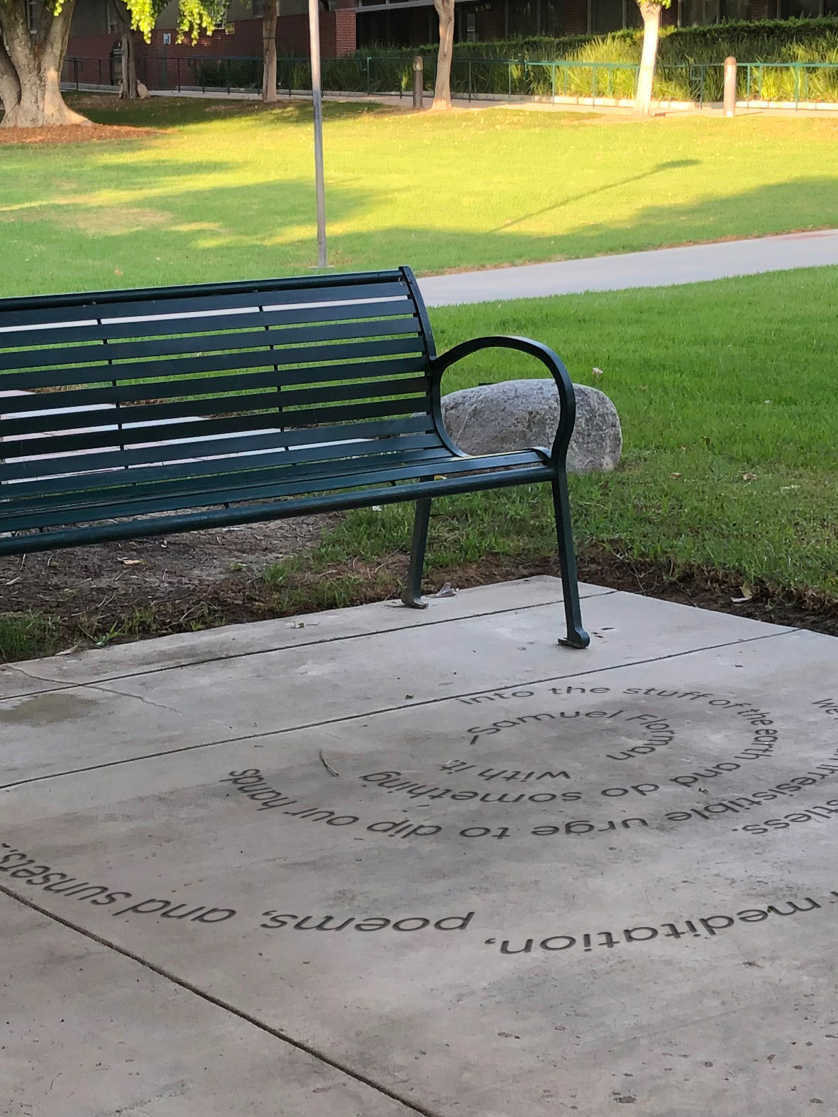
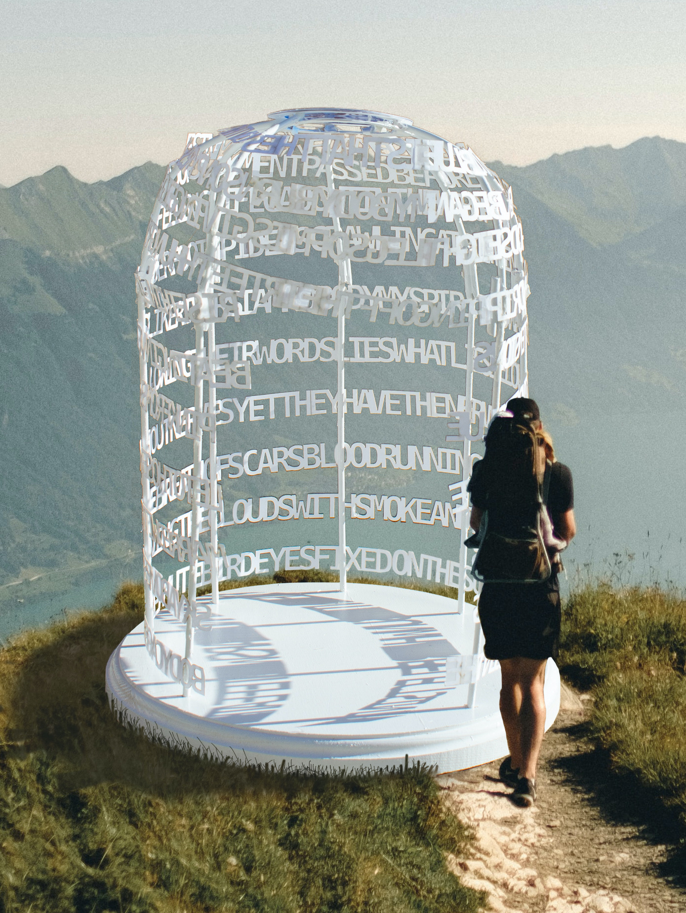
I designed this mural (Gesture 10) as part of Astek's Resonance collection.

The Task
Work within recently-updated Astek Home brand guidelines to create a cohesive brand experience for customers across all touchpoints: social media content, website design, packaging stickers, and customer-facing documents.
The Solution
Careful application of the brand's logo, colors, typography, and imagery style across multiple mediums, both print and digital. Keeping the fresh, bright, airy, creative vibe coherent throughout was key to the brand's consistency.

Variety of stickers (3" diameter) used to brand the Astek Home packages before shipping them to customers.

Astek Home media kit to share with potential influencer partners, showcasing our brand, our products, and ways to partner with us.

Downloadable installation guide for traditional wallpaper, featuring supplies, tips, step-by-step instructions, and a glossary of wallpaper-specific terms.

Astek Home gift card to be used as a raffle prize at one of Astek's trade show booths, featuring a mockup of a wallpaper available on the site.

Astek Home Social Media Graphics

This installment of the "One Pattern, Two Ways" series showcases two ways to use Astek Home's Climbing Hydrangea wallpaper in your home, including a carousel post and accompanying Stories posts to link directly to the product.

For the Labor Day sale, I created static posts and Stories posts to link directly to the sale.

A carousel post and accompanying Stories posts showcase four ideas for using wallpaper in the kitchen.

Astek Home Product Display Page Redesign

Original product display page.

The existing product display pages on astekhome.com needed an update. Customer service representatives were getting many repeat questions (including "how do I order?") from potential customers, so it was clear that key information was not being conveyed clearly. In addition to this, the real estate of the page was not being used to the fullest potential.
I created an updated page layout in Figma to hand to our developer to create in our Shopify site. The new layout has a clearer hierarchy of information that makes more sense to someone buying wallpaper for the first time. Page real estate is better utilized and more in line with our competitors' websites– customers know where to look for the information they need. 
I created a more detailed form for customers looking to customize a pattern. This made it easier for the Astek Home team to process the orders correctly and collect the right information up front about the custom project.
I improved our built-in square footage calculator to help customers figure out how much wallpaper to order. The existing calculator only allowed for one wall at a time to be calculated, so I designed the new calculator to have the ability to calculate multiple walls. 
Finally, I designed a pop-up to confirm when a product has been added to cart, something that the existing site was missing. 

Default view of product display page.

Product display page with "Available Materials" section expanded.

Product display page with "Shipping and Returns" section expanded.

Product display page with "Additional Specs" section expanded.

Product display page with square footage calculator pop-up.

Product display page with "Item Added to Cart" confirmation pop-up.

Product display page with "Customize This Design" pop-up.

Product display page with "Customize This Design" pop-up.

See my work on the Astek Home Instagram account– everything from March 2024 onward.

More projects:

Back to Top